Avengelyne #1 Comic Review – Chromium Wraparound Variant (1995)

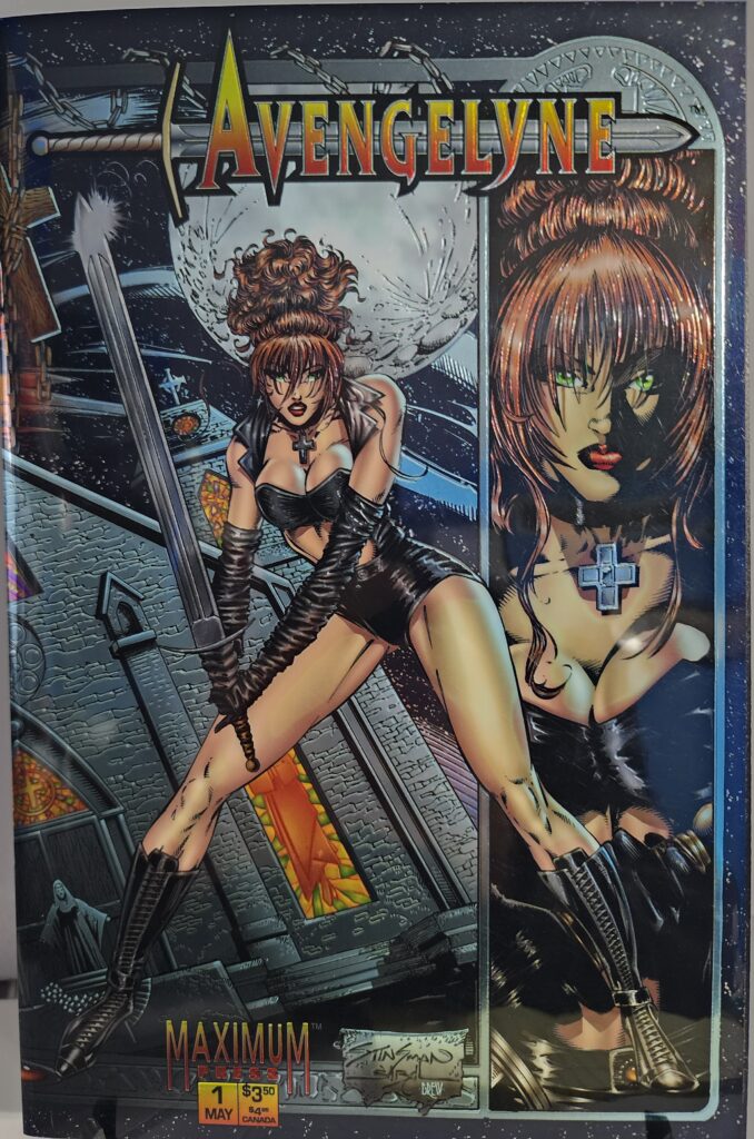
Avengelyne begins her supernatural battle on Earth in Avengelyne #1, featuring a striking John Stinsman chromium wraparound cover.

This Avengelyne #1 comic review looks back at the 1995 Maximum Press premiere issue that introduced readers to the fallen angel Avengelyne.

Robert Napton writes the story, with artwork by John Stinsman.

Avengelyne was once part of Heaven’s Warhost.

After falling from grace, she is forced to live on Earth as a mortal while the forces of Hell continue to threaten the world around her.

This copy features the Chromium Wraparound Variant, one of the most visually distinctive editions of the first issue. The reflective metallic artwork extends across both the front and back covers, giving the comic the unmistakable look of a premium 1990s collector edition.
Comic Book Details

  • Title: Avengelyne
  • Issue: #1
  • Volume: 1
  • Publisher: Maximum Press
  • Publication Date: May 1995
  • Written By: Robert Napton
  • Art: John Stinsman
  • Cover Variant: Chromium Wraparound Variant
  • Cover Pencils: John Stinsman
  • Cover Inks: Jon Sibal
  • Cover Colors: Drew Posada
  • Pages: 36
  • Genre: Fantasy, Supernatural, Superhero

The chromium edition uses a full wraparound metallic cover with artwork continuing onto the back of the comic.

The cover immediately looks like a product of the mid-1990s comic boom, but that is also part of its appeal.

Metallic printing, dramatic fantasy artwork, demons, chains, a gothic church and Avengelyne with an oversized sword combine into a cover designed to demand attention on a comic-shop shelf.

Avengelyne #1 Comic Review: Story Analysis

Avengelyne begins with a strong supernatural premise.

She is not simply another costumed superhero.

She is a fallen angel.

Once a member of Heaven’s Warhost, Avengelyne loses much of the power and status she once possessed.

Now she exists on Earth as a mortal.

That does not mean Hell has forgotten her.

The first issue establishes a world where supernatural forces remain active and dangerous.

Avengelyne finds herself caught between the divine world she once belonged to and the human world where she now has to survive.

That conflict gives the character an identity separate from the traditional superhero books that dominated comic shelves at the time.

Her enemies are not bank robbers or ordinary criminals.

They are demons and supernatural forces.

That immediately gives the series a darker fantasy tone.

A Fallen Angel as a Superhero

The most interesting part of Avengelyne is the contradiction at the center of the character.

She once belonged to Heaven.

Now she does not.

She still understands the forces she once fought beside, but she no longer possesses the same place among them.

At the same time, she knows exactly what waits on the other side.

Hell is not an abstract concept to her.

It is an enemy she understands.

That gives Avengelyne a personal reason to fight supernatural threats.

She is not simply protecting humanity because that is what superheroes do.

Her battles are connected to her own fall, her own history and the world she lost.

That gives the basic good-versus-evil conflict more personal weight.

Art and Visual Design

John Stinsman handles the artwork.

The visual style fits the era perfectly.

Characters are dramatic.

Bodies are exaggerated.

Weapons are enormous.

Demons are grotesque.

The supernatural elements are not subtle.

That approach works for Avengelyne because the book is not trying to present a quiet or realistic world.

It is built around angels, demons, Hell and supernatural warfare.

The artwork embraces that scale.

There is also a heavy gothic influence.

Churches, crosses, chains, stained glass and demonic imagery appear alongside the superhero design language.

That mixture helps Avengelyne stand apart from more conventional 1990s action comics.

The Chromium Wraparound Cover

The biggest collector feature of this edition is the chromium wraparound cover.

Chromium covers were one of the defining premium-format ideas of the 1990s comic market.

Publishers used metallic surfaces, foil, holograms, embossing and other production techniques to make certain editions feel more substantial than ordinary comics.

Avengelyne #1 leans directly into that trend.

John Stinsman’s artwork continues across the entire exterior.

The front focuses on Avengelyne standing outside the church with her sword while a second portrait dominates the side panel.

Turn the comic over and the supernatural imagery continues.

Demons tower behind the church while religious figures stand below them.

The metallic surface gives the dark blues, oranges and golds an additional reflective quality.

This is not a subtle cover.

It was never intended to be.

It was designed to look expensive, dramatic and collectible.

Three decades later, that aggressive 1990s presentation has become part of the book’s personality.

Maximum Press and the 1990s Comic Era

Avengelyne arrived during one of the most visually experimental periods in American comics.

Publishers were competing heavily for attention.

Variant covers became increasingly common.

Special printing techniques became selling points.

New characters were often launched with multiple editions aimed directly at collectors.

Maximum Press embraced that environment.

Avengelyne fit naturally into the era’s interest in darker heroes, supernatural themes and highly stylized artwork.

The character also belongs to the wave of so-called “bad girl” comics that became especially prominent during the decade.

Those books combined superhero action, fantasy, horror and exaggerated character design.

Avengelyne had all of those ingredients.

The difference was the religious and supernatural mythology at the center of her story.

Collectibility and Market Significance

Avengelyne #1 was released in May 1995 by Maximum Press.

The chromium edition was produced alongside a regular photo-cover edition.

The chromium version is specifically cataloged as a wraparound metallic variant, with John Stinsman on pencils, Jon Sibal on inks and Drew Posada on colors.

That makes the physical presentation an important part of the collectible.

Collectors are not simply buying the story.

They are buying a specific piece of 1990s comic-production history.

The chromium surface, wraparound artwork and supernatural design give this edition a visual identity the regular cover does not have.

That does not automatically make the comic rare or extremely valuable.

Many 1990s specialty covers were produced specifically for the collector market.

However, surviving high-grade copies still appeal to collectors who enjoy chromium covers, Maximum Press titles, Rob Liefeld-related properties and 1990s independent comics.

Why the Chromium Edition Still Works

A lot of 1990s gimmick covers can feel disconnected from the comic underneath.

This one works better because the production style matches the material.

Avengelyne is already an exaggerated supernatural fantasy.

A metallic wraparound cover full of demons, churches, swords and religious imagery does not feel out of place.

It feels appropriate.

The chromium effect also gives the book a physical presence that cannot be reproduced by simply looking at a digital cover image.

Light moves across the surface.

Dark areas change depending on the angle.

Metallic details become more visible when the book is tilted.

That tactile quality is one reason specialty covers remain interesting to collectors even decades after the original speculation boom ended.

Final Verdict

Avengelyne #1 is very much a product of 1995.

That is not necessarily a criticism.

The exaggerated supernatural action, dramatic artwork and premium chromium presentation capture a specific moment in comic-book history.

Robert Napton introduces Avengelyne as a fallen angel caught between Heaven, Hell and the mortal world.

John Stinsman gives the character the larger-than-life visual style the concept demands.

The Chromium Wraparound Variant is the real attraction of this particular edition.

Its metallic finish and full front-to-back artwork make it far more visually distinctive than an ordinary copy.

For collectors who enjoy 1990s independent comics, chromium covers, supernatural characters and unusual premium editions, Avengelyne #1 remains an interesting piece of the era.

Recommended for Avengelyne collectors, Maximum Press fans, chromium-cover collectors, 1990s comic collectors, supernatural-comic readers and anyone interested in the excess and experimentation of the decade’s comic market.


Avengelyne #1 Chromium Wraparound Variant is available from Razmataz Comics & Hobbies at razmatazcomics.com while supplies last.
Black Cat #1 Comic Review – Mike Mayhew Exclusive Virgin Variant (2019)

Felicia Hardy launches her first ongoing solo series in Black Cat #1, featuring the Mike Mayhew Exclusive Virgin Art Variant.

This Black Cat #1 comic review looks at the 2019 Marvel launch that gave Felicia Hardy her first ongoing solo series.

Jed MacKay writes the issue, with Travel Foreman handling the main story artwork.

Black Cat has spent years stealing from some of the most dangerous people in the Marvel Universe.

Now those choices are catching up with her.

The police want Felicia.

The New York Thieves Guild wants her.

And Odessa Drake intends to make sure Black Cat understands exactly who controls the criminal world of New York.

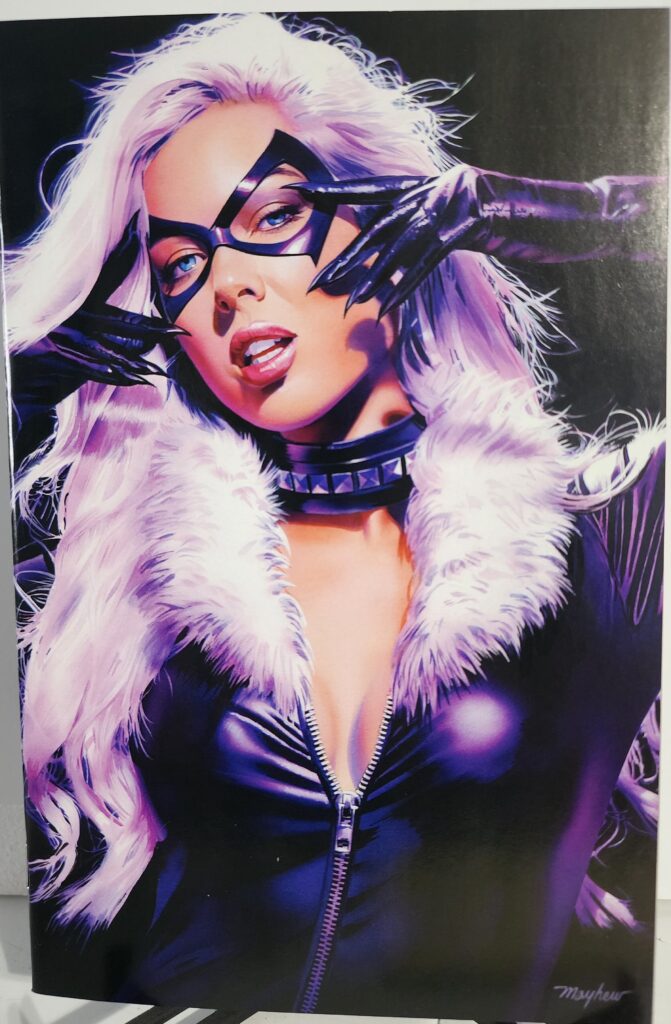
This copy features the Mike Mayhew Exclusive Virgin Art Variant, cataloged by ComicBase as Variant V53. The virgin presentation removes the normal logo and trade dress so Mayhew’s artwork dominates the entire cover.

Comic Book Details

  • Title: Black Cat
  • Issue: #1
  • ComicBase Variant: V53
  • Volume: 1
  • Publisher: Marvel Comics
  • Release Date: June 5, 2019
  • Cover Date: August 2019
  • Written By: Jed MacKay
  • Main Story Art: Travel Foreman
  • Colors: Brian Reber
  • Letters: Ferran Delgado
  • Cover Variant: Mike Mayhew Exclusive Virgin Art Variant
  • Cover Artist: Mike Mayhew
  • Cover Price: $4.99
  • Rating: T
  • UPC: 75960609420200146

Marvel launched Black Cat #1 on June 5, 2019 as the beginning of Felicia Hardy’s first ongoing solo title. The exact UPC for this edition identifies it as the Mike Mayhew Exclusive Virgin Art version.

Mike Mayhew gives Felicia Hardy the entire cover.

Without a title logo or standard trade dress competing for attention, the image works more like a character portrait than a normal monthly comic cover.

Black Cat #1 Comic Review: Story Analysis

Felicia Hardy is very good at stealing things.

That has never been the problem.

The problem is what happens afterward.

Black Cat #1 begins with Felicia operating exactly where she is most comfortable.

She is planning jobs.

She is breaking into places she should not be.

She is taking things that belong to other people.

Then the consequences arrive.

The New York Thieves Guild does not appreciate independent thieves operating without permission.

Felicia has ignored their rules.

Now Odessa Drake wants payment.

That gives the first issue a strong central conflict.

Felicia is not trying to save the world.

She is trying to survive a criminal system that believes she belongs under its control.

That is a much better fit for Black Cat than turning her into a conventional superhero.

She has always worked best somewhere between hero and criminal.

Jed MacKay understands that.

Felicia Hardy Takes the Lead

Black Cat has spent much of her history connected to Spider-Man.

That relationship will always be part of the character.

This series gives Felicia something more important.

Her own story.

She does not need Peter Parker to create the conflict.

The police are chasing her because of her own actions.

The Thieves Guild is targeting her because of her own decisions.

Her reputation belongs to her.

That immediately makes the book feel different from a Spider-Man supporting-character spinoff.

Felicia is the center of the story.

Her skills matter.

Her mistakes matter.

Her past matters.

That is exactly what a solo Black Cat series needs.

The Thieves Guild and Odessa Drake

The Thieves Guild gives Felicia a problem she cannot solve simply by being the best thief in the room.

The Guild represents structure.

Felicia represents independence.

She steals because she wants to.

She chooses her own targets.

She follows her own rules.

Odessa Drake sees things differently.

A thief operating in New York is operating inside Guild territory.

That means Felicia’s success becomes an insult.

The better Black Cat becomes, the bigger the problem gets.

This creates a natural conflict because neither side wants the same thing.

Felicia wants freedom.

The Guild wants control.

Art and Visual Design

Travel Foreman handles the artwork for the main story.

That gives the book the speed and movement a Black Cat comic needs.

Felicia should never look heavy or slow.

She climbs.

She jumps.

She breaks into impossible locations.

Her fighting style depends as much on agility and timing as strength.

The artwork allows her to move through environments instead of simply standing in them.

That matters in a comic built around theft.

A heist story needs locations that feel like puzzles.

Doors, windows, security systems, rooftops and guarded rooms all become part of the action.

Felicia’s ability to move through those spaces helps define who she is.

The Mike Mayhew Virgin Cover

The Mike Mayhew Exclusive Virgin Art Variant takes a very different approach from the standard Black Cat #1 cover.

Mayhew removes everything that is not essential.

There is no large Black Cat logo across the top.

There is no normal trade dress competing with the artwork.

Felicia is the cover.

That works especially well with Black Cat because the character already has such a recognizable visual identity.

White hair.

Black costume.

Black mask.

Fur trim.

A strong Black Cat image does not need a title to explain who the character is.

The virgin presentation takes advantage of that.

It gives collectors the artwork without interruption.

For buyers who collect cover art as much as the comic itself, that matters.

Mike Mayhew and Collector Appeal

Mike Mayhew has produced numerous character-focused comic covers, and his style works particularly well with Black Cat.

Felicia is a character who depends heavily on attitude.

She has to look confident.

She has to look dangerous.

She also has to look like she knows something everyone else does not.

Mayhew’s cover leans into that personality.

The result feels more like a finished art print than a standard issue sitting on a newsstand.

That is one reason virgin variants can appeal to cover collectors.

The comic itself has not changed.

The presentation has.

This edition allows the artwork to become the collectible feature.

A Variant-Heavy First Issue

Black Cat #1 received a large number of variant covers.

Grand Comics Database catalogs more than forty alternate versions of the first issue, including regular variants, retailer exclusives, virgin covers and convention editions. The Mike Mayhew Exclusive and Mike Mayhew Exclusive Virgin Art versions are cataloged separately, with the virgin carrying UPC 75960609420200146.

That matters when evaluating the book as a collectible.

The word “variant” alone does not make a comic rare.

Collectors need to know exactly which version they are buying.

For this copy, the important identifiers are:

Mike Mayhew. Virgin Art. UPC 75960609420200146. ComicBase V53.

Those details separate it from the Mayhew trade-dress version and from the many other Black Cat #1 covers.

Collectibility and Market Significance

Black Cat #1 has several things working in its favor as a collectible.

It is issue #1.

It launched Felicia Hardy’s first ongoing solo series.

It features one of Marvel’s most recognizable Spider-Man-related characters.

It also has an enormous variant-cover lineup, which created a collecting market around specific artists and versions.

The Mike Mayhew Virgin Art edition appeals primarily to collectors who want this particular cover rather than buyers simply looking for the cheapest reading copy.

That distinction is important.

A standard Black Cat #1 and a retailer-exclusive virgin variant contain the same story.

They are not the same collectible.

Collectors interested in Mike Mayhew, Felicia Hardy or virgin covers may specifically seek this version.

At the same time, the large number of Black Cat #1 variants means buyers should focus on exact edition identification rather than assuming every exclusive is automatically scarce.

Black Cat’s First Ongoing Series

The historical importance of Black Cat #1 comes from more than the number on the cover.

Marvel promoted the 2019 series as Black Cat’s first-ever ongoing solo series.

That gives the issue a legitimate place in Felicia Hardy’s publishing history.

Black Cat had existed for decades before 2019.

She had appeared in Spider-Man comics.

She had appeared in limited series and team-ups.

But this series finally allowed her to carry an ongoing title under her own name.

That makes issue #1 a natural book for Black Cat collectors even before variant covers enter the discussion.

Final Verdict

Black Cat #1 succeeds because it understands what makes Felicia Hardy interesting.

She is not simply a Spider-Man supporting character.

She is not a traditional superhero.

She is a thief who wants to control her own life.

Jed MacKay builds the opening issue around that independence and immediately gives Felicia an enemy that wants to take it away.

The Thieves Guild and Odessa Drake create a conflict that fits Black Cat naturally.

Travel Foreman gives the main story the movement and energy a heist comic needs.

The Mike Mayhew Exclusive Virgin Art Variant adds a separate collector appeal.

The lack of trade dress lets Mayhew’s artwork stand on its own, while the exact UPC and ComicBase V53 designation help distinguish this copy from the large number of other Black Cat #1 variants.

For collectors interested in Felicia Hardy, Mike Mayhew or exclusive virgin covers, this is one of the more distinctive editions of Black Cat’s first ongoing-series debut.

Recommended for Black Cat fans, Felicia Hardy collectors, Mike Mayhew collectors, virgin-cover collectors, Spider-Man readers and collectors interested in key first issues from Marvel characters.


Black Cat #1 V53 Mike Mayhew Exclusive Virgin Art Variant is available from Razmataz Comics & Hobbies at razmatazcomics.com while supplies last.
Friendly Neighborhood Mary Jane #1 Comic Review – Peach Momoko Momo-Tone Variant (2026)

Mary Jane Watson launches Watson Productions in Friendly Neighborhood Mary Jane #1, featuring a Peach Momoko Momo-Tone variant cover.

This Friendly Neighborhood Mary Jane #1 comic review looks at Marvel’s new solo series built around Mary Jane Watson.

Ashley Allen writes the series, while Phil Noto handles the interior artwork.

Mary Jane has spent years as a model, actress, friend, partner, hero, and survivor.

Now she is adding another job to the list.

Producer.

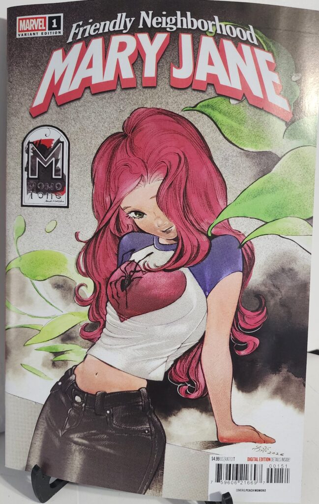
This copy features the Cover G Peach Momoko Momo-Tone Variant. Momoko gives Mary Jane a softer and more personal presentation, with flowing red hair, muted colors, and a quiet pose that separates this cover from the louder superhero variants surrounding the launch.

Comic Book Details

  • Title: Friendly Neighborhood Mary Jane
  • Issue: #1
  • Volume: 1
  • Publisher: Marvel Comics
  • Release Date: November 4, 2026
  • Cover Date: January 2027
  • Written By: Ashley Allen
  • Art: Phil Noto
  • Cover Variant: Cover G Peach Momoko Momo-Tone Variant
  • Cover Artist: Peach Momoko
  • Cover Price: $4.99
  • Pages: 32
  • Rating: T
  • UPC: 75960621669700151

Marvel introduces Mary Jane’s new role as producer at Watson Productions while Chameleon moves in to sabotage her plans.

Peach Momoko keeps the focus almost entirely on Mary Jane. Her flowing red hair and relaxed pose create a much quieter image than a typical superhero action cover.

The Momo-Tone style gives the image a softer texture, while the darker background keeps Mary Jane at the center of the composition.

Friendly Neighborhood Mary Jane #1 Comic Review: Story Analysis

Mary Jane Watson has always lived close to superheroes.

That does not mean her life has ever been simple.

She has dealt with danger, fame, relationships, villains, and the chaos that comes with being connected to Spider-Man’s world.

Friendly Neighborhood Mary Jane #1 gives her another chance to stand on her own.

This time, the story begins with Watson Productions.

Mary Jane is stepping into the role of producer.

That gives her something she can control.

At least, that is the plan.

Chameleon quickly threatens that stability.

His interest in sabotaging the production gives the first issue a direct conflict without reducing Mary Jane to someone waiting for Spider-Man to rescue her.

She has her own problem.

She has her own resources.

She also has something connected to Venom that may give her an unexpected advantage.

That creates a useful balance between Mary Jane’s civilian life and the superhero world surrounding her.

The series does not need to turn her into another traditional costumed hero.

Her strength comes from experience, intelligence, determination, and the strange situations she has already survived.

Art and Visual Design

Phil Noto handles the interior artwork.

That is a strong fit for Mary Jane.

Noto is especially good at faces, expressions, clothing, and quieter character moments.

Those elements matter in a book centered on someone whose life exists between celebrity culture and superhero chaos.

Mary Jane needs to feel like a real person rather than simply another figure standing beside Spider-Man.

Noto’s style helps accomplish that.

The production setting should also give the book room to explore environments outside the usual rooftops and battle scenes.

Studios, sets, offices, and public appearances can all become part of the visual identity.

That helps Friendly Neighborhood Mary Jane separate itself from a standard Spider-Man title.

The Peach Momoko Momo-Tone Cover

The Peach Momoko Momo-Tone Variant is the strongest reason to choose this particular edition.

Momoko does not surround Mary Jane with villains or explosions.

She lets the character carry the image.

Mary Jane stands in a simple pose while her red hair becomes the dominant visual element.

The shirt, dark jeans, pale background, and green leaves keep the palette restrained.

That restraint works.

Mary Jane does not need an action scene to be recognizable.

The red hair immediately identifies her.

Momoko then gives the image a softer emotional quality.

It feels more like a character portrait than a superhero poster.

That makes it especially appropriate for a series designed to give Mary Jane her own spotlight.

Mary Jane Watson

Mary Jane has existed in Spider-Man comics for decades, but her role has constantly changed.

She has been a model.

She has been an actress.

She has been Peter Parker’s partner and wife in different versions of Marvel continuity.

She has also developed an identity beyond those relationships.

Friendly Neighborhood Mary Jane builds directly on that idea.

Mary Jane is not simply reacting to Peter Parker’s life.

She is trying to build something herself.

Watson Productions gives her that opportunity.

The Chameleon threat immediately tests whether she can hold onto it.

That makes the conflict personal.

The villain is not just threatening New York.

He is threatening something Mary Jane created.

The Chameleon Threat

Chameleon is a particularly good villain for this kind of story.

His ability to change identities creates problems that do not require a massive battle.

A production company depends on people.

Actors.

Crew.

Executives.

Security.

Contacts.

Any one of those people could become a vulnerability when Chameleon is involved.

That gives the story room for paranoia and deception.

Mary Jane has spent enough time around superheroes to know that appearances can be dangerous.

The question is whether that experience will help her identify the threat before Chameleon destroys what she has built.

Collectibility and Market Significance

Friendly Neighborhood Mary Jane #1 launches a new Marvel series centered on one of Spider-Man’s most recognizable supporting characters.

Marvel released several covers for the first issue.

J. Scott Campbell created Cover A.

Russell Dauterman created Cover B.

Simone Di Meo supplied the 1:25 incentive.

Mr. Garcin created Cover D.

Bruce Timm created Cover E.

J. Scott Campbell also supplied the 1:100 virgin incentive.

Peach Momoko created the Cover G Momo-Tone Variant.

The Momoko edition is an open-order variant rather than a ratio incentive.

Collectors should not expect artificial scarcity.

Its appeal comes from the artist, the character, and the fact that this is issue #1.

Peach Momoko has a strong collector following.

Mary Jane also has a large audience beyond readers who collect every Spider-Man issue.

That gives this edition appeal to several groups at once.

Mary Jane collectors may want it.

Peach Momoko collectors may want it.

Spider-Man readers may want the launch issue.

Those factors make the Cover G variant one of the more visually distinctive regular covers for the book.

Final Verdict

Friendly Neighborhood Mary Jane #1 gives Mary Jane Watson a new direction without disconnecting her from the world readers already know.

Ashley Allen places her in charge of Watson Productions and immediately introduces a threat capable of attacking both her career and her personal life.

Phil Noto’s artwork gives the series a character-focused visual foundation.

The Peach Momoko Momo-Tone Variant adds a quieter and more elegant cover option.

Rather than treating Mary Jane as another superhero action figure, Momoko presents her as the center of the story.

That makes the cover fit the concept extremely well.

Recommended for Mary Jane Watson fans, Spider-Man readers, Peach Momoko collectors, Marvel collectors, and readers interested in seeing Mary Jane take the lead in her own series.


Friendly Neighborhood Mary Jane #1 Peach Momoko Momo-Tone Variant is available from Razmataz Comics & Hobbies at razmatazcomics.com while supplies last.

Magic: The Gathering Untold Stories Liliana #1 Comic Review – Sibylline Meynet Variant (2026)

Liliana Vess hunts Griselbrand on Innistrad in Magic: The Gathering Untold Stories Liliana #1, featuring the Sibylline Meynet Cover B.

This Magic: The Gathering Untold Stories Liliana #1 comic review looks at Dark Horse’s new four-part story centered on Liliana Vess.

Torunn Grønbekk writes the series. Nataliia Rerekina handles the interior artwork, with colors by Lauren Affe and lettering by Clayton Cowles.

Liliana became one of the multiverse’s most powerful necromancers through bargains with four demons.

Those bargains gave her tremendous power.

They also cost her freedom.

Now Liliana intends to take it back.

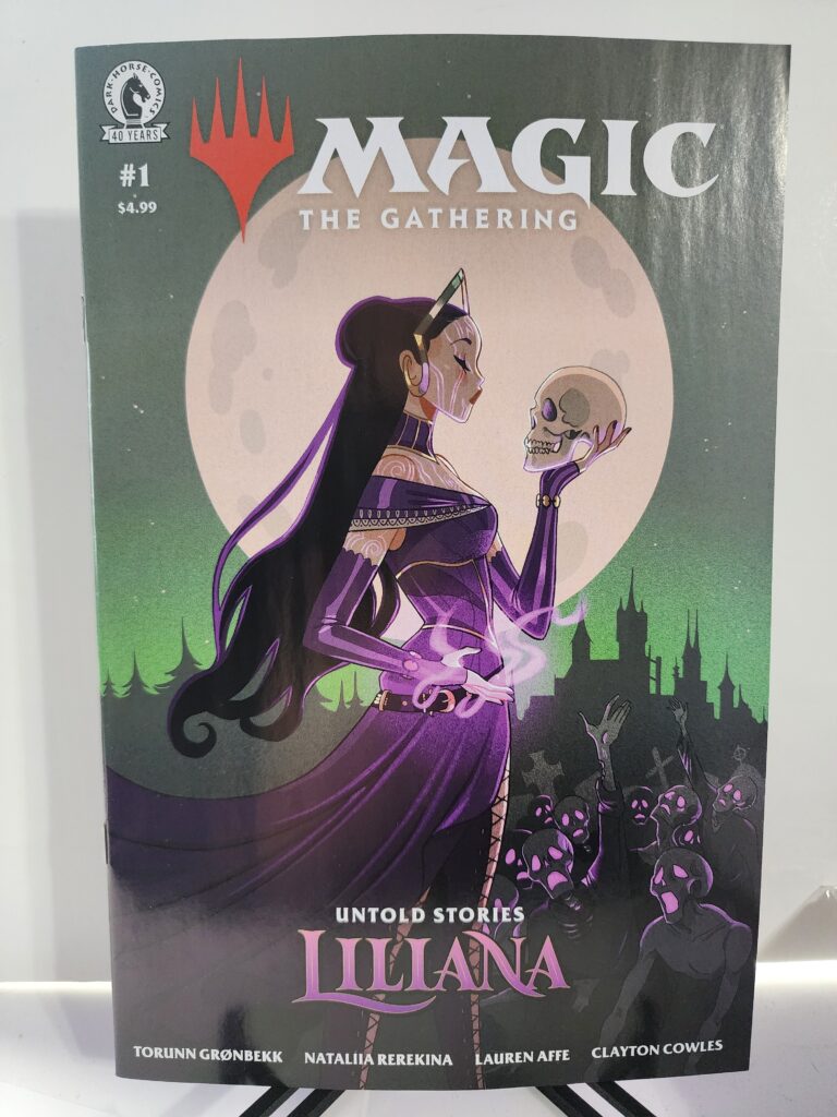
This copy features the Cover B Sibylline Meynet Variant. Meynet places Liliana beneath a huge moon while she calmly holds a skull in one hand. Purple magic surrounds her body as undead figures rise below.

Comic Book Details

  • Title: Magic: The Gathering: Untold Stories – Liliana
  • Issue: #1
  • Volume: 1
  • Publisher: Dark Horse Comics
  • Release Date: October 14, 2026
  • Cover Date: October 2026
  • Written By: Torunn Grønbekk
  • Art: Nataliia Rerekina
  • Colors: Lauren Affe
  • Letters: Clayton Cowles
  • Cover Variant: Cover B Sibylline Meynet Variant
  • Cover Artist: Sibylline Meynet
  • Cover Price: $4.99
  • Pages: 32
  • Rating: T
  • UPC: 76156801633800121
  • Series Length: 4 issues

Dark Horse confirms the creative team, $4.99 price, 32-page length, October 14 release, and four-issue format. Cover B is officially credited to Sibylline Meynet. Penguin Random House Comics Retail

Sibylline Meynet’s cover immediately identifies Liliana as a necromancer. She stands calmly beneath an enormous moon while holding a skull almost as if she is studying it.

The purple magic, distant castle, and undead figures create a gothic fantasy atmosphere without making Liliana appear threatened by any of it.

Magic: The Gathering Untold Stories Liliana #1 Comic Review: Story Analysis

Liliana Vess has enormous power.

That power came with a price.

She bargained her soul to four demons: Kothophed, Razaketh, Belzenlok, and Griselbrand.

Eventually, Liliana decided she would no longer accept the terms of those bargains.

She began hunting the demons connected to her contracts.

That search brings her to Innistrad.

Liliana believes Griselbrand is there.

Unfortunately, Innistrad is already filled with corruption, supernatural violence, and creatures that would be dangerous to almost anyone else.

Liliana is not almost anyone else.

She walks directly into that world because freedom matters more to her than safety.

Torunn Grønbekk uses a straightforward motivation to drive the story.

Liliana wants control over her own future.

To get it, she must confront the beings who helped give her power in the first place.

Dark Horse presents the series as an untold story from Liliana’s past rather than a simple retelling of events longtime Magic players already know. Penguin Random House Comics Retail

That gives the comic two audiences.

Existing Magic fans get another piece of Liliana’s history.

New readers get a dark fantasy story about a powerful necromancer trying to escape the consequences of her own decisions.

Art and Visual Design

Nataliia Rerekina handles the interior artwork.

Liliana’s story needs darkness without turning every page into the same visual tone.

Innistrad provides plenty of opportunities for gothic horror.

The world contains demons, undead creatures, vampires, corruption, and violence.

Liliana fits naturally into that environment.

She does not enter Innistrad as a frightened visitor.

Death is already part of her power.

That means the artwork can make Innistrad threatening while still showing that Liliana belongs in this kind of world.

The contrast is important.

The setting can be horrifying without making Liliana look helpless.

The Sibylline Meynet Cover B

The Sibylline Meynet Cover B takes a cleaner and more stylized approach than the darker Abigail Larson Cover C.

Liliana dominates the image.

A massive pale moon sits directly behind her.

She holds a skull at eye level while purple magical energy circles around her other hand.

Below her, undead figures gather in front of a distant gothic structure.

The composition immediately communicates who Liliana is.

She controls death.

She does not fear it.

The skull is not presented as something gruesome.

Liliana holds it almost casually.

That gives the image confidence rather than horror.

Meynet also uses a restrained palette.

Purple identifies Liliana immediately.

The muted green background keeps the cover from becoming overly bright.

The pale moon creates a strong focal point behind her face and the skull.

It is a very different interpretation from Abigail Larson’s Cover C, but it suits the character equally well.

Liliana Vess

Liliana has always been defined by the relationship between power and consequence.

She wanted strength.

She received it.

Then she learned that power obtained through a bargain still belongs partly to whoever controls the bargain.

That gives this story its central conflict.

Liliana is powerful enough to challenge monsters that would terrify other characters.

Yet the real problem is personal.

She wants ownership of her own life.

That makes her motivation easy to understand even for readers unfamiliar with years of Magic: The Gathering lore.

Liliana made dangerous choices.

Now she intends to deal with the consequences herself.

Innistrad and the Horror Setting

Innistrad is an ideal world for a Liliana story.

The plane already combines fantasy and gothic horror.

Death is everywhere.

So are creatures that refuse to remain dead.

Liliana’s necromancy therefore feels like a natural part of the environment.

That creates an interesting reversal.

In many fantasy stories, a necromancer would be the frightening presence entering an ordinary world.

Here, Liliana enters a world that may be just as disturbing as she is.

Her hunt for Griselbrand gives the story direction while Innistrad supplies additional threats along the way.

The setting also allows Dark Horse to emphasize the darker side of Magic without losing the fantasy elements that define the game.

Collectibility and Market Significance

Magic: The Gathering: Untold Stories – Liliana #1 begins a four-issue Dark Horse miniseries. Penguin Random House Comics Retail

Dark Horse released three regular covers for issue #1.

Nataliia Rerekina created Cover A.

Sibylline Meynet created Cover B.

Abigail Larson created Cover C. Penguin Random House Comics Retail

All three regular covers carry the same original $4.99 price.

That means the Sibylline Meynet edition is an open-order variant rather than a ratio incentive.

Collectors should not buy it expecting artificial scarcity.

Its appeal comes from other factors.

It is issue #1.

It stars Liliana Vess.

It begins a short four-part series.

It also features a visually distinct cover by Sibylline Meynet.

Magic: The Gathering brings another collecting audience into the equation.

Comic collectors may want the series.

Magic players may want Liliana material even if they do not normally collect comics.

Cover-artist collectors may specifically want the Meynet edition.

That gives this issue several possible audiences beyond readers simply following the story.

Final Verdict

Magic: The Gathering: Untold Stories – Liliana #1 begins with a strong character and an immediately understandable goal.

Liliana wants her freedom.

The demons connected to her past stand in the way.

Torunn Grønbekk uses that conflict to explore another part of Liliana’s history while Nataliia Rerekina brings the dark world of Innistrad to the page.

The Sibylline Meynet Cover B Variant gives this edition a different personality from the other regular covers.

Liliana standing beneath the moon with a skull in her hand captures the character without needing an elaborate action scene.

She looks calm.

She looks powerful.

Most importantly, she looks completely at home surrounded by death.

Recommended for Magic: The Gathering fans, Liliana Vess collectors, Sibylline Meynet collectors, dark fantasy readers, Innistrad fans, and anyone interested in exploring Magic lore through comics.


Magic: The Gathering: Untold Stories – Liliana #1 Sibylline Meynet Cover B Variant is available from Razmataz Comics & Hobbies at razmatazcomics.com while supplies last.

Starship Godzilla: Invasion X #1 Comic Review – Gavin Fullerton IDW Goes Dark Variant (2026)

Starship Godzilla returns as war with the Xiliens escalates in Invasion X #1, featuring Gavin Fullerton’s dark Cover C variant.

This Starship Godzilla Invasion X #1 comic review looks at the beginning of IDW’s new five-issue continuation of the Starship Godzilla story.

Chris Gooch writes the series. Oliver Ono handles the interior artwork.

The crew of Starship Godzilla survived its first confrontation with the Xiliens.

That victory did not end the conflict.

It started a war.

Now the crew needs to improve its ship while bounty hunters close in and the Xiliens prepare a new cosmic kaiju weapon.

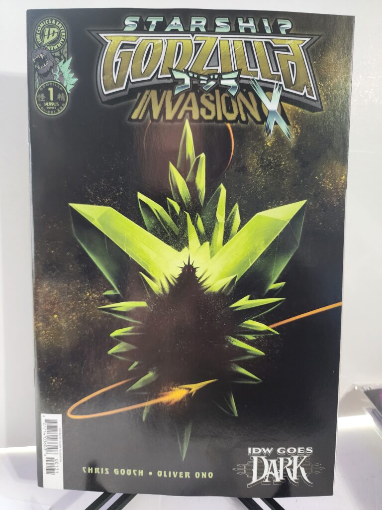
This copy features the Cover C Gavin Fullerton IDW Goes Dark Variant. Fullerton gives Godzilla a much darker presentation than the other regular covers. Godzilla appears almost completely in silhouette, framed by sharp green crystalline shapes against a nearly black background.

Comic Book Details

  • Title: Starship Godzilla: Invasion X [Kai-Sei Era]
  • Issue: #1
  • Volume: 1
  • Publisher: IDW Publishing
  • Release Date: October 14, 2026
  • Cover Date: October 2026
  • Written By: Chris Gooch
  • Art: Oliver Ono
  • Cover Variant: Cover C Gavin Fullerton IDW Goes Dark Variant
  • Cover Artist: Gavin Fullerton
  • Cover Price: $4.99
  • Pages: 36
  • Rating: T+
  • UPC: 82771403600800131
  • Series Length: 5 issues

IDW confirms the $4.99 price, October 14 release, 36-page format, and five-issue series. This exact UPC is identified as the Gavin Fullerton IDW Goes Dark Variant. Penguin Random House Comics Retail Grand Comics Database

Gavin Fullerton strips away most of the detail normally associated with a Godzilla cover. The King of the Monsters becomes a dark shape surrounded by violent green forms.

Only the glowing red eyes immediately break through the darkness. The result gives the cover a threatening horror quality that fits the IDW Goes Dark theme extremely well.

Starship Godzilla Invasion X #1 Comic Review: Story Analysis

The first Starship Godzilla adventure ended with the crew defeating the Xiliens.

Invasion X #1 immediately deals with the consequences.

Winning one battle did not remove the enemy.

Instead, it pushed the conflict into something larger.

The crew now has to prepare Starship Godzilla for another confrontation.

That means upgrades.

It also means surviving long enough to get them.

M Space Hunter Nebula Aliens are already pursuing the crew for a bounty.

Meanwhile, the Xiliens continue working on a new cosmic kaiju weapon.

That gives the opening issue several problems at once.

The heroes have damaged equipment.

They have enemies chasing them.

They know an even larger threat is being assembled somewhere else.

Chris Gooch does not have to spend much time creating a new premise.

The story already has momentum.

The first series established the players.

Invasion X can immediately make the situation worse.

Art and Visual Design

Oliver Ono handles the interior artwork.

Starship Godzilla combines several visual ideas that could easily become overwhelming.

There are giant monsters.

There are spaceships.

There are alien civilizations.

There are strange weapons and enormous battles.

Instead of trying to make the concept restrained, the series embraces the scale.

That approach suits Godzilla.

The character has always worked best when the threat feels enormous.

Moving Godzilla into space simply removes another limit.

Cities are no longer the largest environments available.

Entire worlds can become part of the battlefield.

The Gavin Fullerton IDW Goes Dark Cover

The Gavin Fullerton Cover C takes a completely different approach from the brighter Joëlle Jones Cover B.

Godzilla is almost hidden.

The body appears primarily as a black silhouette.

Bright green crystalline shapes explode around the figure while a pair of tiny red eyes look directly out from the darkness.

That restraint makes the image more threatening.

A detailed Godzilla image tells the viewer exactly what they are looking at.

Fullerton does the opposite.

He lets the familiar outline do the work.

The dorsal plates and shape of the head are enough to identify Godzilla.

Everything else disappears into shadow.

The green forms add another layer of uncertainty.

They could suggest energy, crystals, alien technology, or something more dangerous.

The cover does not explain them.

It simply makes Godzilla look trapped inside or emerging from something unnatural.

That makes it a particularly strong fit for the IDW Goes Dark branding.

Godzilla in Space

Moving Godzilla away from Earth opens up the concept.

The character is no longer limited to cities, military forces, and familiar terrestrial opponents.

Space allows the creators to use alien species, enormous ships, unfamiliar technology, and threats that would be difficult to justify in a conventional Godzilla story.

The Xiliens fit naturally into that world.

They already have deep connections to the science-fiction side of Godzilla history.

The M Space Hunter Nebula Aliens add another recognizable element.

Those connections help Starship Godzilla feel experimental without becoming disconnected from the larger franchise.

The Kai-Sei Era

Starship Godzilla: Invasion X is part of IDW’s Kai-Sei Era.

The larger concept allows creators to take familiar Godzilla elements and rebuild them in new settings.

Starship Godzilla may be one of the clearest examples.

The title alone tells readers this is not another conventional monster story.

Godzilla has become part of a cosmic adventure.

That approach creates room for old enemies and ideas to return in very different forms.

It also gives the comic its own identity instead of simply recreating something already seen in the films.

Collectibility and Market Significance

Starship Godzilla: Invasion X #1 begins a five-issue limited series. Penguin Random House Comics Retail

The first issue received several covers.

Oliver Ono created Cover A.

Joëlle Jones created Cover B.

Gavin Fullerton created the Cover C IDW Goes Dark Variant.

Louie Joyce created the movie-homage retailer incentive cover. Grand Comics Database

The Gavin Fullerton edition is an open-order variant rather than a ratio incentive.

Its appeal comes from the artwork rather than artificial scarcity.

The IDW Goes Dark design also gives it a visual identity that separates it from the brighter regular covers.

Collectors interested in Godzilla horror imagery may prefer this edition specifically because it avoids the colorful space-opera presentation used on some of the other covers.

It is also issue #1.

That gives the book additional appeal for collectors who prefer first issues and complete limited-series runs.

Final Verdict

Starship Godzilla: Invasion X #1 wastes little time expanding the conflict.

The crew defeated the Xiliens once.

Now they have bounty hunters behind them, a damaged ship to improve, and another cosmic weapon waiting ahead.

Chris Gooch uses the first issue to push the existing story forward instead of resetting it.

Oliver Ono continues the visual world of Starship Godzilla while the cosmic setting gives the series room to make everything larger.

The Gavin Fullerton IDW Goes Dark Variant gives this edition its strongest individual identity.

The black Godzilla silhouette, glowing red eyes, sharp green forms, and nearly empty background turn the King of the Monsters into something ominous rather than heroic.

It is simple.

It is dark.

It works.

Recommended for Godzilla collectors, Kai-Sei Era readers, Gavin Fullerton collectors, IDW Goes Dark collectors, kaiju fans, and readers who enjoy the science-fiction side of the Godzilla universe.


Starship Godzilla: Invasion X #1 Gavin Fullerton IDW Goes Dark Variant is available from Razmataz Comics & Hobbies at razmatazcomics.com while supplies last.