Teenage Mutant Ninja Turtles #23 Comic Review – Damien Worm IDW Goes Dark Variant (2026)

The undead invade New York in TMNT #23. We look at The City That Never Dies storyline and Damien Worm’s IDW Goes Dark variant.

This Teenage Mutant Ninja Turtles #23 comic review looks at the latest chapter of IDW’s The City That Never Dies storyline from writer Gene Luen Yang and artist Fero Pe. New York’s supernatural crisis reaches a new level as the barrier between the living and the dead begins to collapse and the Turtles are forced to fight on multiple fronts.

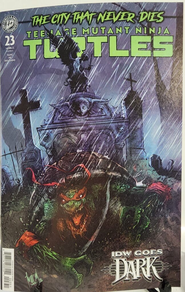
This copy features the Cover E Damien Worm IDW Goes Dark Variant, transforming Raphael and the TMNT world into a much darker horror-inspired image.
Comic Book Details

Title: Teenage Mutant Ninja Turtles
Issue: #23
Volume: 1
Publisher: IDW Publishing
Release Date: October 14, 2026
Cover Date: October 2026
Written By: Gene Luen Yang
Art: Fero Pe
Colors: Luis Antonio Delgado
Cover Variant: Cover E IDW Goes Dark Variant
Cover Artist: Damien Worm
Cover Price: $4.99
Pages: 32
UPC: 82771403315102351
Storyline: The City That Never Dies, Part Three

Damien Worm’s cover pushes Teenage Mutant Ninja Turtles directly into horror territory. Raphael charges through a rain-soaked cemetery while distorted figures and ominous architecture surround him.

The dark greens, purples and heavy shadows fit the IDW Goes Dark theme perfectly, giving the familiar TMNT world the atmosphere of a supernatural horror comic rather than a traditional martial-arts adventure.

Teenage Mutant Ninja Turtles #23 Comic Review: Story Analysis

Teenage Mutant Ninja Turtles #23 continues The City That Never Dies as the supernatural invasion of New York grows increasingly dangerous.

The veil between worlds has collapsed, allowing undead members of the Foot Clan, Purple Dragons and other threats to spill into the city. With the crisis spreading too quickly for the Turtles to handle as a single group, they are forced to divide their efforts.

At the same time, Baxter Stockman forms a dangerous new alliance while Shinigami faces questions about where her loyalty truly lies.

That setup gives writer Gene Luen Yang several conflicts to develop at once. The Turtles are not simply confronting another gang or mutant enemy—the city itself is becoming increasingly hostile as the distinction between the living and the dead begins to disappear. Penguin Random House Comics Retail

The supernatural direction also fits TMNT surprisingly well. The franchise has always mixed martial arts, science fiction, mutants and mysticism, so an undead invasion does not feel out of place.

Art and Visual Design

Fero Pe handles the interior artwork, with Luis Antonio Delgado providing colors. Grand Comics Database

A story involving an undead New York gives the creative team an opportunity to make familiar streets and characters feel less safe than usual.

Rain, darkness, supernatural enemies and the breakdown of normal city life all push the visual tone toward horror while still allowing the Turtles’ action-heavy style to remain at the center of the book.

For this edition, however, Damien Worm’s cover is the immediate attraction.

Worm’s work naturally suits horror imagery, and the IDW Goes Dark theme gives him room to emphasize atmosphere instead of presenting the Turtles in a conventional action pose.

The result looks almost like a horror paperback illustration, with Raphael appearing less like a superhero and more like a lone survivor moving through a nightmare.

Character Development

Splitting the Turtles apart creates opportunities to emphasize their individual personalities instead of relying entirely on the group dynamic.

The larger supernatural conflict also tests characters outside the four brothers.

Shinigami’s loyalty becomes increasingly important as alliances shift, while Baxter Stockman’s new partnership threatens to make an already chaotic situation worse.

That gives the issue multiple personal conflicts beneath the larger undead invasion.

The Turtles have survived countless threats together, but a crisis that forces them to operate separately changes the equation. Each brother has to deal with danger without immediately relying on the rest of the family.

Collectibility and Market Significance

Teenage Mutant Ninja Turtles #23 has several things that make this particular edition appealing to collectors.

The issue is part of The City That Never Dies storyline, released during IDW’s October horror promotion, and features one of the company’s IDW Goes Dark variant covers.

The Damien Worm Cover E is an open-order variant rather than a ratio incentive, so it should not automatically be treated as scarce. IDW also released other covers for the issue, including variants by Kevin Eastman and Ben Bishop, Marcelo Ventura, J. Gonzo and incentive editions. Penguin Random House Comics Retail

Its appeal comes primarily from the artwork and the IDW Goes Dark theme.

For collectors who like darker TMNT imagery, horror comics or Damien Worm’s work, this version has a distinct visual identity that separates it from the regular covers.

Final Verdict

Teenage Mutant Ninja Turtles #23 pushes The City That Never Dies deeper into supernatural horror while keeping the core TMNT combination of action, family and strange New York threats intact.

Gene Luen Yang’s storyline expands the conflict by forcing the Turtles to split up while Baxter Stockman and Shinigami add additional complications.

For collectors, the Damien Worm IDW Goes Dark Variant is especially well matched to the story. Its cemetery setting, rain-soaked atmosphere and horror styling make it one of the more distinctive covers for the issue.

Recommended for TMNT readers, Damien Worm collectors, horror-comic fans and anyone following The City That Never Dies storyline.


Teenage Mutant Ninja Turtles #23 Damien Worm IDW Goes Dark Variant is available from Razmataz Comics & Hobbies at razmatazcomics.com while supplies last.
Infernal Hulk vs. Fantastic Four #1 Comic Review: Story Analysis

Infernal Hulk attacks the Fantastic Four in this Hulk War prelude. We look at the story, Cian Tormey’s art and Clayton Crain variant.

Infernal Hulk vs. Fantastic Four #1 begins with New York under threat and Reed Richards holding what may be one of the few weapons capable of stopping the coming disaster.

That weapon is the Immaculate Engine, a mysterious supernatural machine housed inside the Baxter Building.

Infernal Hulk knows exactly what it represents.

If Reed can activate the engine, Hulk’s growing army could potentially be destroyed in a single strike. That makes the Fantastic Four and their headquarters an obvious target.

Writer Phillip Kennedy Johnson uses the setup to bring two very different corners of Marvel together. The Fantastic Four traditionally approach impossible problems through science, exploration and teamwork. Infernal Hulk represents something far more primal and supernatural.

That collision creates the central tension of the issue.

The Fantastic Four are not simply trying to overpower Hulk. They have to resist his corruptive influence long enough to protect Reed’s invention and prevent themselves from being transformed into new recruits for the Infernal Avengers.

As a Hulk War Prelude, the one-shot also functions as a bridge into the larger conflict rather than an isolated battle.

Art and Visual Design

Cian Tormey handles the interior artwork, and the premise gives him a wide range of visual material to work with.

The Fantastic Four bring bright superhero imagery, technology and the familiar environments of the Baxter Building. Infernal Hulk brings monstrous proportions, supernatural corruption and horror.

That contrast is important because the story depends on Hulk feeling fundamentally different from the kind of threats Reed Richards usually solves with another invention.

The result is a battle between clean Marvel science-fiction imagery and something darker and less predictable.

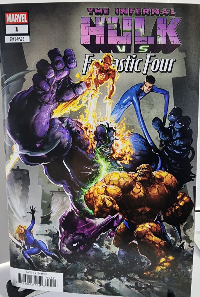
For this edition, Clayton Crain’s variant cover pushes heavily into that horror side.

Crain’s Infernal Hulk feels enormous, distorted and almost demonic, while the Fantastic Four appear comparatively small beneath him. The composition reinforces the scale of the threat before the reader ever opens the book.

Character Development

Reed Richards sits at the center of the conflict because the Immaculate Engine represents exactly the sort of solution readers expect from Mister Fantastic.

When an impossible threat appears, Reed builds something capable of confronting it.

The problem this time is that building the solution also makes the Fantastic Four a target.

Infernal Hulk understands that destroying the machine may not be enough. Corrupting the people responsible for it could turn some of Marvel’s greatest heroes into weapons against everyone else.

That gives the battle a more personal dimension than a simple Hulk-versus-Thing rematch.

The Fantastic Four have always been strongest as a family. A supernatural threat capable of twisting members of that family against one another attacks the team at its most important foundation.

Collectibility and Market Significance

Infernal Hulk vs. Fantastic Four #1 has several features that make it interesting for collectors.

It is a one-shot, serves as a Hulk War Prelude, and puts the Fantastic Four directly into the growing Infernal Hulk storyline.

Marvel released the issue with several covers, including regular open-order variants from Clayton Crain, Danny Earls and Ken Lashley, along with higher-ratio incentive covers by Greg Land and Ken Lashley. Penguin Random House Comics Retail

The Clayton Crain Variant is an open-order cover rather than a ratio incentive, so scarcity should not automatically be assumed.

Its appeal comes instead from Crain’s artwork and the subject matter.

Crain’s painted approach is especially well suited to Hulk, symbiotes and darker supernatural characters, making his version visually distinct from the other standard covers for the issue.

The combination of Fantastic Four, Infernal Hulk, a crossover one-shot and a named modern cover artist gives the book several different collector audiences.

Final Verdict

Infernal Hulk vs. Fantastic Four #1 takes the Fantastic Four out of their usual science-fiction comfort zone and throws them directly into the supernatural horror surrounding Infernal Hulk.

Phillip Kennedy Johnson’s premise gives Reed Richards something potentially capable of ending Hulk’s army while simultaneously making the entire Fantastic Four a target.

Cian Tormey handles the interior conflict, while Clayton Crain’s variant cover emphasizes the monstrous scale of Infernal Hulk and the danger facing Marvel’s First Family.

For collectors, the Clayton Crain Variant is one of the stronger visually themed versions of the issue, particularly for readers who prefer the darker side of modern Hulk stories.

Recommended for Hulk readers, Fantastic Four fans, Clayton Crain collectors, and anyone following the buildup to Hulk War.


Infernal Hulk vs. Fantastic Four #1 Clayton Crain Variant is available from Razmataz Comics & Hobbies at razmatazcomics.com while supplies last.
Wolverine: Paradise #1 Comic Review – Phil Noto Foil Variant (2026)

Logan heads to Miami in Wolverine: Paradise #1. We look at Dan Panosian’s new series, Dazzler’s role and the Phil Noto foil variant.

This Wolverine: Paradise #1 comic review looks at Marvel’s new 2026 Wolverine series from writer and artist Dan Panosian. Logan steps away from the X-Men and heads to Miami, where the city’s glitz and glamour hide a dangerous criminal underworld waiting to drag Wolverine back into trouble.

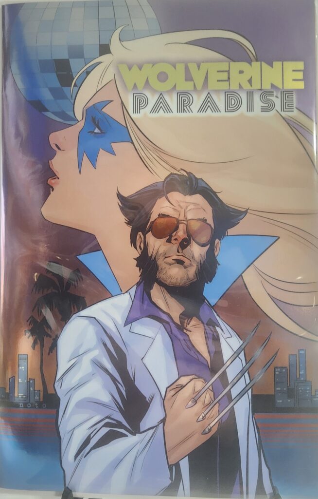
This copy features the Phil Noto Cover D Foil Variant, with Logan dressed for Miami nightlife while Dazzler dominates the background in a stylish retro composition.

Comic Book Details

  • Title: Wolverine: Paradise
  • Issue: #1
  • Volume: 1
  • Publisher: Marvel Comics
  • Release Date: October 14, 2026
  • Written By: Dan Panosian
  • Art: Dan Panosian
  • Cover Variant: Cover D Phil Noto Foil Variant
  • Cover Artist: Phil Noto
  • Cover Price: $7.99
  • Rating: T+
  • UPC: 75960621351100121

Phil Noto’s foil cover gives Wolverine a completely different look from the usual battlefield or wilderness imagery associated with the character. Logan stands in a white jacket and sunglasses with his claws extended, while Dazzler and a disco-inspired background reinforce the Miami setting.

The foil treatment fits the nightlife theme particularly well, giving the cover a polished, almost poster-like appearance that stands apart from the more traditional Wolverine variants.

Wolverine: Paradise #1 Comic Review: Story Analysis

Wolverine: Paradise #1 takes Logan somewhere considerably different from his usual surroundings.

After stepping away from the X-Men, Wolverine heads to Miami looking for a change of pace. What he finds instead is a city where glamour, nightlife, and wealth sit directly above a dangerous criminal underworld.

That setup gives writer and artist Dan Panosian an opportunity to pull Wolverine out of familiar territory. Rather than placing Logan in another wilderness survival story or mutant conflict, the series drops him into a stylish urban environment where the danger is hidden beneath the surface.

The premise works because Logan is never particularly good at staying out of trouble. Even when he attempts to distance himself from the X-Men and the larger superhero world, violence has a way of finding him.

The addition of Dazzler also makes sense for the Miami setting. Her celebrity background and connection to music and nightlife give the story a character who naturally fits the environment while providing a strong contrast to Logan’s rougher personality.

Art and Visual Design

Because Dan Panosian handles both the writing and artwork, Wolverine: Paradise has a strong unified visual identity.

Miami gives Panosian an opportunity to work with a very different palette and atmosphere than readers might normally associate with Wolverine. Bright lights, nightlife, tropical scenery, and upscale environments create a sharp contrast with Logan himself.

That contrast helps sell the central idea of the book: Wolverine may have traveled to paradise, but he does not necessarily belong there.

For this particular version, Phil Noto’s foil variant leans heavily into the stylish side of the concept. Logan’s white jacket, sunglasses, and exposed claws give him a sleek Miami look while still making it immediately clear that Wolverine is never far from violence.

Dazzler’s oversized portrait in the background ties the cover directly to the issue’s setting and supporting cast, while the foil finish adds another layer to the disco-inspired presentation.

Character Development

Wolverine: Paradise #1 begins with Logan attempting to separate himself from the X-Men and find something resembling a break from his usual life.

That idea alone gives the story room to explore Wolverine outside of the team dynamic.

Logan has always struggled with the idea of peace. Even when he wants a quieter life, his instincts, reputation, and history tend to pull him back toward violence.

Placing him in Miami creates an interesting contradiction. The setting promises sunshine, glamour, and escape, while Logan remains someone constantly prepared for the next fight.

Dazzler offers another contrast. She is comfortable in the world of entertainment and nightlife, while Wolverine approaches that environment as an outsider. Their different personalities give the series an opportunity to explore Logan from a different angle than the usual mutant-team setting.

Collectibility and Market Significance

Wolverine: Paradise #1 has several things working in its favor as a collectible.

It is the first issue of a new Wolverine series, features Dan Panosian as both writer and artist, introduces a new Miami-based direction for Logan, and includes Dazzler as a prominent supporting character.

Marvel released the issue with several different covers, including standard variants and higher-ratio incentives. The Phil Noto Cover D Foil Variant carries a higher original cover price of $7.99, compared with $4.99 for the standard covers. Midtown Comics

This is not a ratio incentive variant, so scarcity should not automatically be assumed. Its appeal comes primarily from Phil Noto’s artwork, the foil treatment, Wolverine, and Dazzler.

That combination gives it strong display appeal for collectors who follow Wolverine, Dazzler, Phil Noto, or modern Marvel foil variants.

Final Verdict

Wolverine: Paradise #1 gives Logan a refreshing change of scenery without abandoning the qualities that make Wolverine work.

Dan Panosian’s Miami setting provides a strong contrast to Logan’s personality, while the criminal-underworld premise ensures that the idea of “paradise” probably will not last very long.

The inclusion of Dazzler gives the series another character who naturally fits the setting and helps distinguish it from a standard Wolverine solo story.

For collectors, the Phil Noto Foil Variant is one of the more visually distinctive versions of the issue. Its retro Miami styling, Wolverine-and-Dazzler composition, and foil finish make it especially attractive as a display copy.

Recommended for Wolverine fans, Dazzler collectors, Phil Noto collectors, and readers looking for a different kind of Wolverine story.


Wolverine: Paradise #1 Phil Noto Foil Variant is available from Razmataz Comics & Hobbies at razmatazcomics.com while supplies last.
Doom All-On-One #1 Comic Review – Puppeteer Lee Foil Variant (2026)

Doctor Doom battles through Hell in Doom All-On-One #1. We look at Al Ewing’s story, Alessandro Cappuccio’s art and the Puppeteer Lee foil variant.

This Doom All-On-One #1 comic review looks at Marvel’s oversized Doctor Doom one-shot from writer Al Ewing and artist Alessandro Cappuccio. Doom once again faces one of the most personal conflicts in his history, descending into Hell and confronting forces powerful enough to challenge even Victor Von Doom’s legendary confidence.

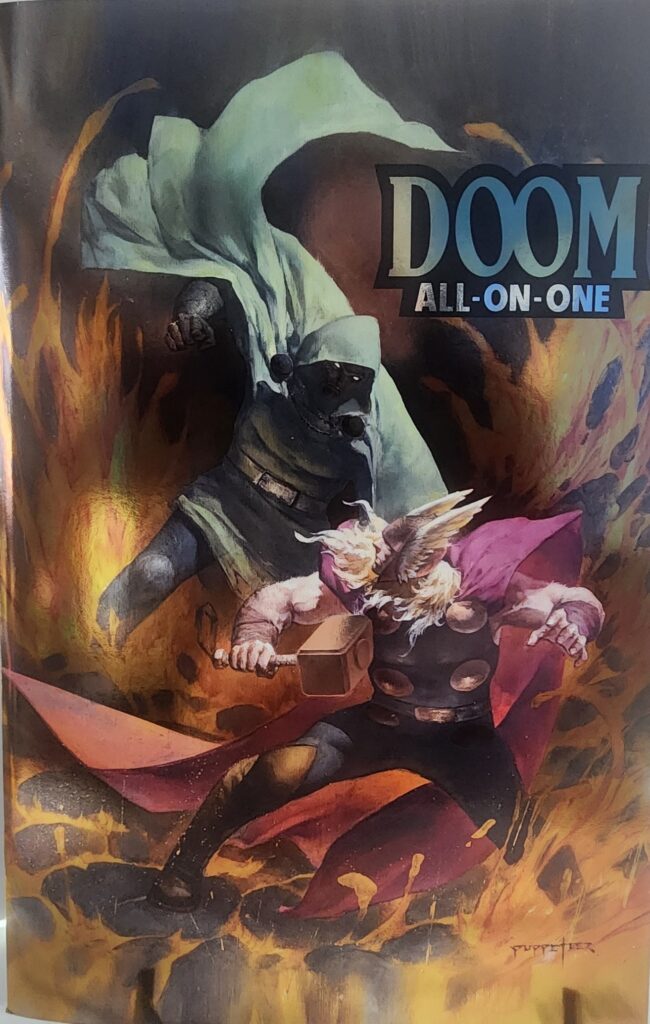
This copy features the Puppeteer Lee Foil Variant, an atmospheric Doctor Doom and Thor cover with an original cover price of $10.99.

Comic Book Details

  • Title: Doom All-On-One
  • Issue: #1
  • Volume: 1
  • Publisher: Marvel Comics
  • Release Date: October 14, 2026
  • Cover Date: December 2026
  • Written By: Al Ewing
  • Art: Alessandro Cappuccio
  • Cover Variant: Puppeteer Lee Foil Variant
  • Cover Artist: Puppeteer Lee
  • Cover Price: $10.99
  • Pages: 64
  • Rating: T+
  • UPC: 75960621472300131

Puppeteer Lee’s foil variant presents Doctor Doom and Thor surrounded by an infernal landscape of fire and shadow. Doom dominates the background while Thor charges forward with Mjolnir, giving the cover a sense of movement and confrontation even before the story begins.

The painted appearance and muted colors contrast sharply with the flames surrounding the characters, while the foil treatment gives the image additional depth and makes this version stand apart from the standard covers.

Doom All-On-One #1 Comic Review: Story Analysis

Doom All-On-One #1 returns to one of the most important elements of Victor Von Doom’s history: his obsession with freeing the soul of his mother from Mephisto.

For Doom, however, even a journey into Hell cannot remain a simple rescue mission. The conflict grows into something much larger, forcing him into an enormous confrontation involving some of the most powerful characters in the Marvel Universe.

Writer Al Ewing has a character perfectly suited to this type of story. Doctor Doom does not approach impossible odds like a normal hero or villain. When the universe appears to stand against him, Doom simply assumes the universe has made a serious mistake.

That attitude provides the foundation for an oversized story built around spectacle, power, and Victor’s absolute refusal to accept defeat.

The book also uses an unusual storytelling format. Much of the action is presented through large, widescreen compositions rather than conventional comic-book panel layouts. That approach makes the issue feel closer to a sequence of enormous cinematic moments than a traditional monthly comic.

Art and Visual Design

Alessandro Cappuccio’s artwork plays a major role in making the unusual format work.

Because the story relies heavily on large compositions, every image needs to communicate movement, scale, and conflict without depending on a dense sequence of smaller panels.

That gives the battles a sense of size appropriate for Doctor Doom. Characters, environments, and supernatural threats are allowed to dominate the page rather than being confined to smaller boxes.

The Hell setting also gives Cappuccio plenty of room to experiment with darkness, fire, supernatural imagery, and massive confrontations.

For this particular version, Puppeteer Lee’s foil cover takes a more painterly approach. Doctor Doom looms over the composition while Thor occupies the foreground with Mjolnir ready, creating an image that feels almost like a fantasy illustration rather than a traditional superhero cover.

The foil finish adds another layer to the presentation and makes the fire, shadows, and metallic elements particularly effective when viewed under changing light.

Character Development

Doctor Doom remains one of Marvel’s most interesting villains because his motivations are often far more personal than his reputation for conquest suggests.

His mother, Cynthia Von Doom, has always been one of Victor’s greatest emotional weaknesses. Doom’s attempts to rescue her soul from Mephisto reveal a side of the character that exists beneath the armor, ego, and constant claims of superiority.

At the same time, Doom never stops being Doom.

Even when his motivation is deeply personal, he approaches every obstacle with complete certainty that he is the smartest, strongest, and most capable person involved.

That combination of genuine devotion and almost unbelievable arrogance is a major reason Victor Von Doom has remained one of Marvel’s most compelling characters for decades.

Collectibility and Market Significance

Doom All-On-One #1 has several elements that could make it appealing to collectors.

It is an oversized Doctor Doom one-shot, written by Al Ewing, illustrated by Alessandro Cappuccio, and presented using an unusual widescreen visual format.

The issue was also released with a variety of variant covers, including foil and incentive editions.

The Puppeteer Lee Foil Variant carries a higher original cover price of $10.99 and offers a dramatically different visual interpretation from many of the other covers available for the issue.

Puppeteer Lee’s painted style, the presence of both Doctor Doom and Thor, and the foil treatment give this edition strong display appeal.

As with most newly released variants, however, long-term value will ultimately depend on collector demand rather than the word “variant” alone.

Final Verdict

Doom All-On-One #1 is built around exactly the kind of excessive premise Doctor Doom deserves.

Al Ewing takes one of Victor’s most personal motivations and expands it into a large-scale Marvel confrontation, while Alessandro Cappuccio’s widescreen presentation gives the story a visual identity different from the average one-shot.

The unusual page design and oversized format make the book interesting even before considering the character involved.

For collectors, the Puppeteer Lee Foil Variant is one of the more visually distinctive versions of the issue. The painted Doom-and-Thor composition combined with the foil finish makes it particularly attractive as a display copy.

Recommended for Doctor Doom fans, Thor collectors, Al Ewing readers, Puppeteer Lee collectors, and anyone looking for an unusual Marvel one-shot with a strong visual presentation.


Doom All-On-One #1 Puppeteer Lee Foil Variant is available from Razmataz Comics & Hobbies at razmatazcomics.com while supplies last.

Alien vs. X-Men #1 Comic Review – Marvel John Romita Jr. Foil Variant (2026)

This Alien vs. X-Men #1 comic review looks at Marvel’s 2026 crossover bringing the X-Men face-to-face with the deadly Xenomorphs. Written by Kieron Gillen with additional material by legendary X-Men writer Chris Claremont, the first issue launches a science-fiction horror crossover that fits naturally into the X-Men universe.

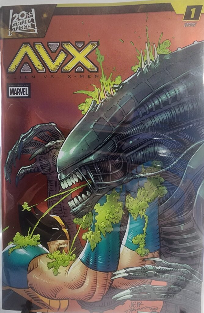
This copy features the John Romita Jr. Cover E Foil Variant, with Wolverine caught in a brutal close encounter with a Xenomorph.

Comic Book Details

  • Title: Alien vs. X-Men
  • Issue: #1
  • Volume: 1
  • Publisher: Marvel Comics
  • Date: September 30, 2026
  • Written By: Kieron Gillen, Chris Claremont
  • Art: Geraldo Borges, David Messina
  • Color Art: Andrew Dalhouse
  • Lettering: VC’s Travis Lanham
  • Cover Variant: Cover E John Romita Jr. Foil Variant
  • Cover Artist: John Romita Jr.
  • Cover Price: $8.99
  • UPC: 75960621578200121

John Romita Jr.’s foil variant puts Wolverine directly beneath a towering Xenomorph, with the Alien dominating the composition while Wolverine fights from a decidedly bad position. The red background, acidic green highlights, and massive black Xenomorph make the cover immediately recognizable even before the foil treatment catches the light.

It is exactly the kind of crossover image collectors expect from Alien vs. X-Men: Wolverine, claws, acid blood, and one very angry Xenomorph.

Alien vs. X-Men #1 Comic Review: Story Analysis

Alien vs. X-Men #1 wastes little time bringing the two properties together. The X-Men head into deep space searching for what they believe is a Phoenix egg, but their mission uncovers something considerably more dangerous. When they return to Earth carrying deadly cargo, the Xenomorph threat comes with them.

The concept works because the X-Men already have a long history with extraterrestrial threats, body horror, and creatures such as the Brood. Dropping Xenomorphs into that environment feels much more natural than the title might initially suggest.

Kieron Gillen’s lead story approaches the crossover as a large-scale action and horror story rather than burying the reader in continuity. That makes the first issue relatively easy to jump into even if you are primarily an Alien fan rather than a regular X-Men reader.

The issue also includes additional material by Chris Claremont involving Kitty Pryde, the Brood, and the Xenomorphs. Bringing Claremont back into an X-Men science-fiction horror setting gives the issue another strong connection to classic X-Men history.

Art and Visual Design

Geraldo Borges handles the main story with artwork suited to both superhero action and the darker science-fiction atmosphere of Alien. The Xenomorphs need to feel physically dangerous even when placed opposite mutants with extraordinary powers, and the visual presentation helps maintain that threat.

Andrew Dalhouse’s colors reinforce the contrast between the traditional X-Men visual language and the darker environments associated with Alien.

David Messina provides artwork for the additional story material, giving that section its own visual identity.

For this particular copy, however, the immediate visual attraction is John Romita Jr.’s foil variant cover. Wolverine and a Xenomorph are natural subjects for Romita’s heavy lines and exaggerated action, and the foil treatment makes an already aggressive cover stand out even more.

Character Development

Alien vs. X-Men #1 is primarily concerned with establishing the crossover threat, so character development takes a back seat to setup and action.

Wolverine is an obvious fit for this type of story. His aggressive fighting style, healing factor, and willingness to get dangerously close to an enemy make a Xenomorph encounter especially entertaining.

Kitty Pryde also receives additional attention through Chris Claremont’s material. Pairing Kitty with both the Brood and the Xenomorphs gives the issue another strong link to the horror and science-fiction side of X-Men history.

The first issue is less about changing these characters and more about seeing how familiar X-Men personalities react when placed against one of science fiction’s most recognizable monsters.

Collectibility and Market Significance

Alien vs. X-Men #1 has several things working in its favor as a collectible. It is the first issue of the crossover, combines two major franchises, features Chris Claremont contributing additional X-Men material, and was released with several distinct variant covers.

The John Romita Jr. Cover E is a foil variant with an original $8.99 cover price. Unlike the higher-ratio incentive variants released for the issue, this version was not an incentive-exclusive cover, so scarcity should not automatically be assumed.

Its long-term value will depend heavily on collector demand for the crossover and the individual cover. The combination of Wolverine, a Xenomorph, John Romita Jr. artwork, and foil presentation gives this version strong display appeal even without artificial scarcity.

Final Verdict

Alien vs. X-Men #1 is exactly the kind of crossover that sounds unusual until you remember how much X-Men history already overlaps with science-fiction horror. Xenomorphs, the Brood, Wolverine, and Kitty Pryde make for a combination that feels considerably more natural than the title might initially suggest.

The first issue delivers the setup, action, and recognizable characters expected from a crossover while leaving room for the conflict to escalate over the remaining issues.

For collectors, the John Romita Jr. foil is one of the more visually distinctive standard variants for the issue. At an $8.99 original cover price, it is also a more accessible alternative to the higher-priced incentive covers.

Recommended for X-Men readers, Alien fans, Wolverine collectors, and anyone who enjoys unusual Marvel crossover events.


Alien vs. X-Men #1 John Romita Jr. Foil Variant is available from Razmataz Comics & Hobbies at razmatazcomics.com while supplies last.