Liliana Vess hunts Griselbrand on Innistrad in Magic: The Gathering Untold Stories Liliana #1, featuring the Sibylline Meynet Cover B.
This Magic: The Gathering Untold Stories Liliana #1 comic review looks at Dark Horse’s new four-part story centered on Liliana Vess.
Torunn Grønbekk writes the series. Nataliia Rerekina handles the interior artwork, with colors by Lauren Affe and lettering by Clayton Cowles.
Liliana became one of the multiverse’s most powerful necromancers through bargains with four demons.
Those bargains gave her tremendous power.
They also cost her freedom.
Now Liliana intends to take it back.
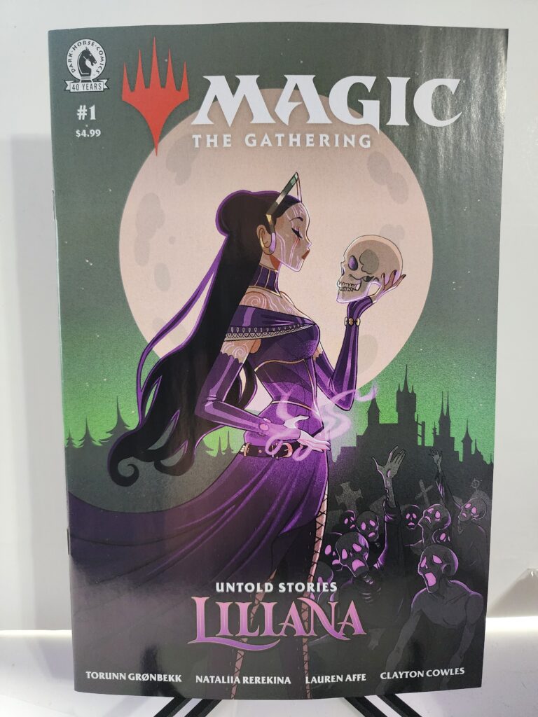
This copy features the Cover B Sibylline Meynet Variant. Meynet places Liliana beneath a huge moon while she calmly holds a skull in one hand. Purple magic surrounds her body as undead figures rise below.
Comic Book Details
Title: Magic: The Gathering: Untold Stories – Liliana
Issue: #1
Volume: 1
Publisher: Dark Horse Comics
Release Date: October 14, 2026
Cover Date: October 2026
Written By: Torunn Grønbekk
Art: Nataliia Rerekina
Colors: Lauren Affe
Letters: Clayton Cowles
Cover Variant: Cover B Sibylline Meynet Variant
Cover Artist: Sibylline Meynet
Cover Price: $4.99
Pages: 32
Rating: T
UPC: 76156801633800121
Series Length: 4 issues
Dark Horse confirms the creative team, $4.99 price, 32-page length, October 14 release, and four-issue format. Cover B is officially credited to Sibylline Meynet. Penguin Random House Comics Retail
Sibylline Meynet’s cover immediately identifies Liliana as a necromancer. She stands calmly beneath an enormous moon while holding a skull almost as if she is studying it.
The purple magic, distant castle, and undead figures create a gothic fantasy atmosphere without making Liliana appear threatened by any of it.
Magic: The Gathering Untold Stories Liliana #1 Comic Review: Story Analysis
Liliana Vess has enormous power.
That power came with a price.
She bargained her soul to four demons: Kothophed, Razaketh, Belzenlok, and Griselbrand.
Eventually, Liliana decided she would no longer accept the terms of those bargains.
She began hunting the demons connected to her contracts.
That search brings her to Innistrad.
Liliana believes Griselbrand is there.
Unfortunately, Innistrad is already filled with corruption, supernatural violence, and creatures that would be dangerous to almost anyone else.
Liliana is not almost anyone else.
She walks directly into that world because freedom matters more to her than safety.
Torunn Grønbekk uses a straightforward motivation to drive the story.
Liliana wants control over her own future.
To get it, she must confront the beings who helped give her power in the first place.
Dark Horse presents the series as an untold story from Liliana’s past rather than a simple retelling of events longtime Magic players already know. Penguin Random House Comics Retail
That gives the comic two audiences.
Existing Magic fans get another piece of Liliana’s history.
New readers get a dark fantasy story about a powerful necromancer trying to escape the consequences of her own decisions.
Art and Visual Design
Nataliia Rerekina handles the interior artwork.
Liliana’s story needs darkness without turning every page into the same visual tone.
Innistrad provides plenty of opportunities for gothic horror.
The world contains demons, undead creatures, vampires, corruption, and violence.
Liliana fits naturally into that environment.
She does not enter Innistrad as a frightened visitor.
Death is already part of her power.
That means the artwork can make Innistrad threatening while still showing that Liliana belongs in this kind of world.
The contrast is important.
The setting can be horrifying without making Liliana look helpless.
The Sibylline Meynet Cover B
The Sibylline Meynet Cover B takes a cleaner and more stylized approach than the darker Abigail Larson Cover C.
Liliana dominates the image.
A massive pale moon sits directly behind her.
She holds a skull at eye level while purple magical energy circles around her other hand.
Below her, undead figures gather in front of a distant gothic structure.
The composition immediately communicates who Liliana is.
She controls death.
She does not fear it.
The skull is not presented as something gruesome.
Liliana holds it almost casually.
That gives the image confidence rather than horror.
Meynet also uses a restrained palette.
Purple identifies Liliana immediately.
The muted green background keeps the cover from becoming overly bright.
The pale moon creates a strong focal point behind her face and the skull.
It is a very different interpretation from Abigail Larson’s Cover C, but it suits the character equally well.
Liliana Vess
Liliana has always been defined by the relationship between power and consequence.
She wanted strength.
She received it.
Then she learned that power obtained through a bargain still belongs partly to whoever controls the bargain.
That gives this story its central conflict.
Liliana is powerful enough to challenge monsters that would terrify other characters.
Yet the real problem is personal.
She wants ownership of her own life.
That makes her motivation easy to understand even for readers unfamiliar with years of Magic: The Gathering lore.
Liliana made dangerous choices.
Now she intends to deal with the consequences herself.
Innistrad and the Horror Setting
Innistrad is an ideal world for a Liliana story.
The plane already combines fantasy and gothic horror.
Death is everywhere.
So are creatures that refuse to remain dead.
Liliana’s necromancy therefore feels like a natural part of the environment.
That creates an interesting reversal.
In many fantasy stories, a necromancer would be the frightening presence entering an ordinary world.
Here, Liliana enters a world that may be just as disturbing as she is.
Her hunt for Griselbrand gives the story direction while Innistrad supplies additional threats along the way.
The setting also allows Dark Horse to emphasize the darker side of Magic without losing the fantasy elements that define the game.
All three regular covers carry the same original $4.99 price.
That means the Sibylline Meynet edition is an open-order variant rather than a ratio incentive.
Collectors should not buy it expecting artificial scarcity.
Its appeal comes from other factors.
It is issue #1.
It stars Liliana Vess.
It begins a short four-part series.
It also features a visually distinct cover by Sibylline Meynet.
Magic: The Gathering brings another collecting audience into the equation.
Comic collectors may want the series.
Magic players may want Liliana material even if they do not normally collect comics.
Cover-artist collectors may specifically want the Meynet edition.
That gives this issue several possible audiences beyond readers simply following the story.
Final Verdict
Magic: The Gathering: Untold Stories – Liliana #1 begins with a strong character and an immediately understandable goal.
Liliana wants her freedom.
The demons connected to her past stand in the way.
Torunn Grønbekk uses that conflict to explore another part of Liliana’s history while Nataliia Rerekina brings the dark world of Innistrad to the page.
The Sibylline Meynet Cover B Variant gives this edition a different personality from the other regular covers.
Liliana standing beneath the moon with a skull in her hand captures the character without needing an elaborate action scene.
She looks calm.
She looks powerful.
Most importantly, she looks completely at home surrounded by death.
Recommended for Magic: The Gathering fans, Liliana Vess collectors, Sibylline Meynet collectors, dark fantasy readers, Innistrad fans, and anyone interested in exploring Magic lore through comics.
Magic: The Gathering: Untold Stories – Liliana #1 Sibylline Meynet Cover B Variant is available from Razmataz Comics & Hobbies at razmatazcomics.com while supplies last.
Starship Godzilla returns as war with the Xiliens escalates in Invasion X #1, featuring Gavin Fullerton’s dark Cover C variant.
This Starship Godzilla Invasion X #1 comic review looks at the beginning of IDW’s new five-issue continuation of the Starship Godzilla story.
Chris Gooch writes the series. Oliver Ono handles the interior artwork.
The crew of Starship Godzilla survived its first confrontation with the Xiliens.
That victory did not end the conflict.
It started a war.
Now the crew needs to improve its ship while bounty hunters close in and the Xiliens prepare a new cosmic kaiju weapon.
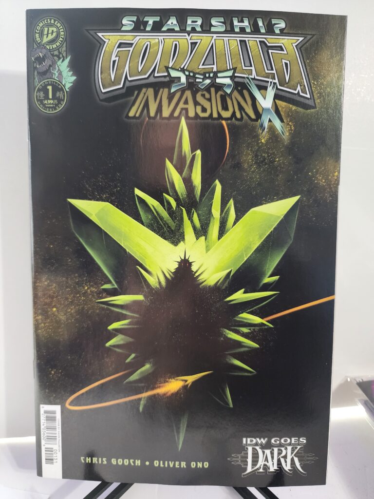
This copy features the Cover C Gavin Fullerton IDW Goes Dark Variant. Fullerton gives Godzilla a much darker presentation than the other regular covers. Godzilla appears almost completely in silhouette, framed by sharp green crystalline shapes against a nearly black background.
Comic Book Details
Title: Starship Godzilla: Invasion X [Kai-Sei Era]
Issue: #1
Volume: 1
Publisher: IDW Publishing
Release Date: October 14, 2026
Cover Date: October 2026
Written By: Chris Gooch
Art: Oliver Ono
Cover Variant: Cover C Gavin Fullerton IDW Goes Dark Variant
Gavin Fullerton strips away most of the detail normally associated with a Godzilla cover. The King of the Monsters becomes a dark shape surrounded by violent green forms.
Only the glowing red eyes immediately break through the darkness. The result gives the cover a threatening horror quality that fits the IDW Goes Dark theme extremely well.
Starship Godzilla Invasion X #1 Comic Review: Story Analysis
The first Starship Godzilla adventure ended with the crew defeating the Xiliens.
Invasion X #1 immediately deals with the consequences.
Winning one battle did not remove the enemy.
Instead, it pushed the conflict into something larger.
The crew now has to prepare Starship Godzilla for another confrontation.
That means upgrades.
It also means surviving long enough to get them.
M Space Hunter Nebula Aliens are already pursuing the crew for a bounty.
Meanwhile, the Xiliens continue working on a new cosmic kaiju weapon.
That gives the opening issue several problems at once.
The heroes have damaged equipment.
They have enemies chasing them.
They know an even larger threat is being assembled somewhere else.
Chris Gooch does not have to spend much time creating a new premise.
The story already has momentum.
The first series established the players.
Invasion X can immediately make the situation worse.
Art and Visual Design
Oliver Ono handles the interior artwork.
Starship Godzilla combines several visual ideas that could easily become overwhelming.
There are giant monsters.
There are spaceships.
There are alien civilizations.
There are strange weapons and enormous battles.
Instead of trying to make the concept restrained, the series embraces the scale.
That approach suits Godzilla.
The character has always worked best when the threat feels enormous.
Moving Godzilla into space simply removes another limit.
Cities are no longer the largest environments available.
Entire worlds can become part of the battlefield.
The Gavin Fullerton IDW Goes Dark Cover
The Gavin Fullerton Cover C takes a completely different approach from the brighter Joëlle Jones Cover B.
Godzilla is almost hidden.
The body appears primarily as a black silhouette.
Bright green crystalline shapes explode around the figure while a pair of tiny red eyes look directly out from the darkness.
That restraint makes the image more threatening.
A detailed Godzilla image tells the viewer exactly what they are looking at.
Fullerton does the opposite.
He lets the familiar outline do the work.
The dorsal plates and shape of the head are enough to identify Godzilla.
Everything else disappears into shadow.
The green forms add another layer of uncertainty.
They could suggest energy, crystals, alien technology, or something more dangerous.
The cover does not explain them.
It simply makes Godzilla look trapped inside or emerging from something unnatural.
That makes it a particularly strong fit for the IDW Goes Dark branding.
Godzilla in Space
Moving Godzilla away from Earth opens up the concept.
The character is no longer limited to cities, military forces, and familiar terrestrial opponents.
Space allows the creators to use alien species, enormous ships, unfamiliar technology, and threats that would be difficult to justify in a conventional Godzilla story.
The Xiliens fit naturally into that world.
They already have deep connections to the science-fiction side of Godzilla history.
The M Space Hunter Nebula Aliens add another recognizable element.
Those connections help Starship Godzilla feel experimental without becoming disconnected from the larger franchise.
The Kai-Sei Era
Starship Godzilla: Invasion X is part of IDW’s Kai-Sei Era.
The larger concept allows creators to take familiar Godzilla elements and rebuild them in new settings.
Starship Godzilla may be one of the clearest examples.
The title alone tells readers this is not another conventional monster story.
Godzilla has become part of a cosmic adventure.
That approach creates room for old enemies and ideas to return in very different forms.
It also gives the comic its own identity instead of simply recreating something already seen in the films.
Gavin Fullerton created the Cover C IDW Goes Dark Variant.
Louie Joyce created the movie-homage retailer incentive cover. Grand Comics Database
The Gavin Fullerton edition is an open-order variant rather than a ratio incentive.
Its appeal comes from the artwork rather than artificial scarcity.
The IDW Goes Dark design also gives it a visual identity that separates it from the brighter regular covers.
Collectors interested in Godzilla horror imagery may prefer this edition specifically because it avoids the colorful space-opera presentation used on some of the other covers.
It is also issue #1.
That gives the book additional appeal for collectors who prefer first issues and complete limited-series runs.
Final Verdict
Starship Godzilla: Invasion X #1 wastes little time expanding the conflict.
The crew defeated the Xiliens once.
Now they have bounty hunters behind them, a damaged ship to improve, and another cosmic weapon waiting ahead.
Chris Gooch uses the first issue to push the existing story forward instead of resetting it.
Oliver Ono continues the visual world of Starship Godzilla while the cosmic setting gives the series room to make everything larger.
The Gavin Fullerton IDW Goes Dark Variant gives this edition its strongest individual identity.
The black Godzilla silhouette, glowing red eyes, sharp green forms, and nearly empty background turn the King of the Monsters into something ominous rather than heroic.
It is simple.
It is dark.
It works.
Recommended for Godzilla collectors, Kai-Sei Era readers, Gavin Fullerton collectors, IDW Goes Dark collectors, kaiju fans, and readers who enjoy the science-fiction side of the Godzilla universe.
Starship Godzilla: Invasion X #1 Gavin Fullerton IDW Goes Dark Variant is available from Razmataz Comics & Hobbies at razmatazcomics.com while supplies last.
Godzilla returns to space in Starship Godzilla: Invasion X #1, beginning a five-issue sequel featuring a Joëlle Jones Cover B variant.
This Starship Godzilla Invasion X #1 comic review looks at the beginning of IDW’s five-part follow-up to the original Starship Godzilla series.
Chris Gooch returns as writer. Oliver Ono handles the interior artwork, with colors by Valentina Pinto and lettering by Hassan Otsmane-Elhaou.
The crew survived its first battle with the Xiliens.
Unfortunately, winning the battle helped start a war.
Now Starship Godzilla needs upgrades, hostile aliens are closing in, and the Xiliens are preparing something even more dangerous.
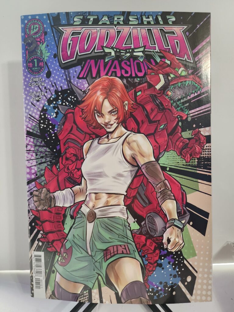
This copy features the Cover B Joëlle Jones Variant. Jones places a determined human character in the foreground while a massive red armored Godzilla dominates the background. Bright reds, greens, purples, and heavy graphic shapes give the cover an energetic science-fiction feel.
Comic Book Details
Title: Starship Godzilla: Invasion X [Kai-Sei Era]
Issue: #1
Volume: 1
Publisher: IDW Publishing
Release Date: October 14, 2026
Cover Date: October 2026
Written By: Chris Gooch
Art: Oliver Ono
Colors: Valentina Pinto
Letters: Hassan Otsmane-Elhaou
Cover Variant: Cover B Joëlle Jones Variant
Cover Artist: Joëlle Jones
Cover Price: $4.99
Pages: 36
Rating: T+
UPC: 82771403600800121
Series Length: 5 issues
IDW lists Starship Godzilla: Invasion X as a five-issue follow-up to the first Starship Godzilla series. Penguin Random House Comics Retail
Joëlle Jones gives Cover B a very different personality from a traditional Godzilla destruction scene. The human figure commands the foreground while the enormous armored Godzilla rises behind her.
The bright red mechanical design immediately sells the idea that this is not simply another monster attack story. This is Godzilla pushed directly into colorful space-opera territory.
Starship Godzilla Invasion X #1 Comic Review: Story Analysis
The original Starship Godzilla story ended with a victory.
Invasion X #1 begins by showing the cost of that victory.
The crew defeated the Xiliens in battle, but they did not eliminate the threat.
Instead, their actions escalated the conflict.
The crew now needs to improve Starship Godzilla before the next confrontation arrives.
They do not have much time.
M Space Hunter Nebula Aliens are already pursuing them for a bounty.
At the same time, the Xiliens are working on the final pieces of a new cosmic kaiju weapon.
Chris Gooch therefore begins the sequel with pressure coming from several directions.
The heroes have problems with their ship.
Enemies are hunting them.
A larger weapon is being built somewhere else.
That gives the first issue a useful sense of momentum.
This is not a new crew slowly discovering the universe.
These characters have already fought a war.
Now they must deal with what happened because they won.
Art and Visual Design
Oliver Ono returns for the interior artwork.
Starship Godzilla requires a strange combination of visual styles.
It needs giant-monster action.
It also needs spaceships, alien technology, strange worlds, and the scale of a science-fiction adventure.
Those elements could easily fight each other.
Instead, the concept works because the book embraces the excess.
Godzilla already feels enormous on Earth.
Putting the character into a cosmic setting allows the creators to make everything around him equally outrageous.
Ships can become larger.
Weapons can become stranger.
Enemies do not have to follow normal terrestrial rules.
That freedom gives Invasion X plenty of room to increase the scale established by the first series.
The Joëlle Jones Cover B
The Joëlle Jones Cover B is one of the strongest reasons to choose this edition.
Jones does not simply place Godzilla in the center and let the character fill the page.
Instead, the human figure occupies the foreground.
She looks confident and ready for action.
Behind her stands the massive armored form of Godzilla.
That arrangement gives both characters importance.
Godzilla still provides the scale and spectacle, but the human element reminds readers that this series also follows a crew.
The colors help considerably.
Red dominates Godzilla’s armor.
Green and white balance the foreground figure.
Purple, blue, black, and halftone patterns create a background that feels more like a science-fiction poster than a conventional monster comic.
It is bright.
It is busy.
It fits Starship Godzilla.
Godzilla Goes Cosmic
Godzilla stories traditionally revolve around cities, governments, scientists, soldiers, and other kaiju.
Starship Godzilla changes the environment.
Space removes many of the usual limits.
A giant monster does not have to remain tied to one country or even one planet.
That opens the door to alien civilizations and technology on a much larger scale.
The Xiliens are particularly appropriate opponents.
They already belong to the science-fiction side of Godzilla history.
Using them in a space-based story feels natural rather than forced.
Invasion X pushes that concept further by giving the Xiliens another cosmic kaiju weapon.
The title itself makes the direction clear.
The first conflict was only the beginning.
Now comes the invasion.
Continuing the Kai-Sei Era
Starship Godzilla: Invasion X is part of IDW’s larger Kai-Sei Era of Godzilla comics.
That gives the series room to reinterpret familiar Toho concepts while keeping Godzilla recognizable.
This book does not need to copy one specific film.
Instead, it can borrow monsters, aliens, technology, and ideas from different parts of Godzilla history and rebuild them around its own universe.
The Starship Godzilla concept may be one of the clearest examples of that freedom.
It takes something familiar and puts it somewhere completely different.
The result still feels like Godzilla.
It simply expands the playground.
Collectibility and Market Significance
Starship Godzilla: Invasion X #1 begins a new five-issue limited series.
IDW released several versions of the first issue.
Oliver Ono created Cover A.
Joëlle Jones created Cover B.
Gavin Fullerton created the Cover C IDW Goes Dark Variant.
The Joëlle Jones Cover B is an open-order variant rather than a ratio incentive.
Collectors should therefore not assume it is scarce simply because it is a variant.
Its attraction comes from the artwork and the artist.
Joëlle Jones has an established following among comic collectors, while Godzilla already has a collecting audience far beyond normal superhero comics.
This is also issue #1 of the second Starship Godzilla storyline.
Those factors give the book several different audiences.
Godzilla collectors may want it.
Joëlle Jones collectors may want it.
Readers who followed the first Starship Godzilla series have an obvious reason to continue.
That makes Cover B a strong alternative to the standard edition even without artificial scarcity.
Final Verdict
Starship Godzilla: Invasion X #1 does exactly what a sequel should do.
It takes the consequences of the first story and makes the situation larger.
The crew won its first fight.
Now the Xiliens are preparing for war.
Chris Gooch immediately gives the crew new problems while Oliver Ono brings Godzilla back into the cosmic setting that distinguishes this series.
The Joëlle Jones Cover B Variant adds another strong reason to choose this particular copy.
Its bright colors, human foreground figure, and enormous armored Godzilla capture the unusual personality of the series.
This is not Godzilla simply destroying another city.
Godzilla has gone to war in space.
Recommended for Godzilla collectors, Kai-Sei Era readers, Joëlle Jones collectors, science-fiction comic fans, kaiju fans, and readers who enjoyed the original Starship Godzilla series.
Starship Godzilla: Invasion X #1 Joëlle Jones Cover B Variant is available from Razmataz Comics & Hobbies at razmatazcomics.com while supplies last.
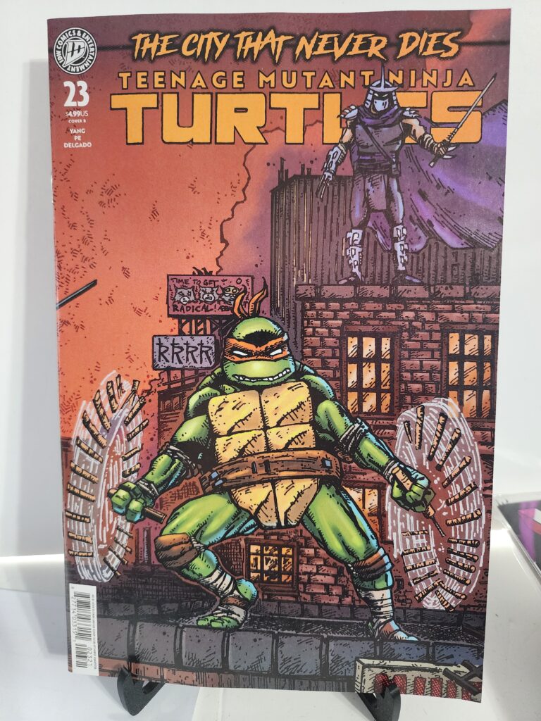
The undead overwhelm New York in TMNT #23. We look at Gene Luen Yang’s story and the Kevin Eastman and Ben Bishop Cover B variant.
This Teenage Mutant Ninja Turtles #23 comic review looks at the latest chapter of IDW’s ongoing TMNT series from writer Gene Luen Yang and artist Fero Pe.
New York is being overwhelmed by the undead.
The barrier between worlds is collapsing, and the Turtles must divide their efforts if they hope to stop the city from falling.
This copy features the Cover B Kevin Eastman and Ben Bishop Variant. The artwork brings Michelangelo and Shredder together in a gritty composition that immediately recalls the rougher visual style associated with the early days of Teenage Mutant Ninja Turtles.
Comic Book Details
Title: Teenage Mutant Ninja Turtles
Issue: #23
Volume: 6
Publisher: IDW Publishing
Release Date: October 14, 2026
Cover Date: October 2026
Written By: Gene Luen Yang
Art: Fero Pe
Cover Variant: Cover B Kevin Eastman & Ben Bishop Variant
Michelangelo dominates the foreground while Shredder watches from above. The rough lines, heavy shadows, brick buildings, and orange-red sky give the image an old-school independent-comic feel.
The cover looks modern without losing the raw visual energy that helped define Teenage Mutant Ninja Turtles in the first place.
Teenage Mutant Ninja Turtles #23 Comic Review: Story Analysis
Teenage Mutant Ninja Turtles #23 throws New York into supernatural chaos.
The barrier between worlds has broken down.
Undead members of the Foot Clan, Purple Dragons, and other threats begin flooding the city.
The Turtles cannot stay together and fight one battle at a time.
They have to split up.
That immediately raises the danger.
The brothers are usually strongest when they work as a unit. Separating them forces each Turtle to handle part of the crisis without relying on the entire family.
Writer Gene Luen Yang also keeps several other conflicts moving.
Baxter Stockman forms a dangerous new alliance.
Shinigami must decide where her loyalty truly belongs.
The city faces threats from several directions at once.
That gives issue #23 a strong sense of momentum.
Art and Visual Design
Fero Pe handles the interior artwork.
An undead invasion gives the issue plenty of opportunities for visual chaos.
The familiar streets of New York become battlefields.
Foot Clan members and Purple Dragons already belong in the TMNT world. Turning those enemies into supernatural threats pushes the series further into horror without abandoning its action roots.
Fero Pe also has to make the divided storylines easy to follow.
The Turtles are not all fighting side by side.
Each part of the city needs its own sense of danger while still feeling connected to the larger crisis.
For this edition, however, the immediate attraction is Kevin Eastman and Ben Bishop’s Cover B.
The cover does not look overly polished.
That is one of its strengths.
The rougher approach gives Michelangelo a sense of movement and danger that fits the story.
Michelangelo and Shredder
Michelangelo is often the most lighthearted member of the team.
This cover does not present him that way.
He looks alert, battered, and ready to fight.
His nunchaku are already moving.
Shredder stands above him like a threat that never completely disappears.
That contrast works well.
Michelangelo brings energy to the lower half of the composition.
Shredder brings tension to the upper half.
Even without reading the issue, the image tells the reader that the situation has become serious.
An Old-School TMNT Feel
Kevin Eastman’s involvement gives the cover an immediate connection to the roots of Teenage Mutant Ninja Turtles.
Eastman helped create the franchise.
His name still carries special weight with TMNT collectors.
Ben Bishop complements that connection instead of trying to make the image look completely different.
The result feels like a modern interpretation of classic TMNT artwork.
Heavy lines and rough textures replace the cleaner finish seen on many current superhero covers.
The city feels dirty.
The characters look like they belong there.
That makes this version especially appealing to readers who prefer the visual personality of older TMNT comics.
Collectibility and Market Significance
Teenage Mutant Ninja Turtles #23 was released with several covers.
Fero Pe created Cover A. Kevin Eastman and Ben Bishop created Cover B. Marcelo Ventura, J. Gonzo, and Damien Worm also contributed variants. IDW released additional ratio incentive editions as well. Penguin Random House Comics Retail
The regular Eastman and Bishop Cover B is an open-order variant.
It is not the 1:10 black-and-white full-art incentive version.
That means collectors should not assume this edition is scarce.
Its appeal comes from the artists.
Kevin Eastman remains one of the most important names associated with TMNT.
Ben Bishop has also built a strong connection with modern Turtles artwork.
For longtime collectors, that combination gives Cover B more meaning than a random alternate image.
Final Verdict
Teenage Mutant Ninja Turtles #23 pushes New York deeper into supernatural chaos.
Gene Luen Yang gives the Turtles a threat large enough to force them apart. Fero Pe handles a city filled with undead enemies and multiple battles.
The issue also keeps Baxter Stockman and Shinigami involved in the larger conflict.
For collectors, the Kevin Eastman and Ben Bishop Cover B is the major attraction of this edition.
The rough artwork, Michelangelo-and-Shredder composition, and connection to TMNT history make it stand apart from the cleaner modern variants.
Recommended for TMNT readers, Michelangelo fans, Shredder collectors, Kevin Eastman collectors, Ben Bishop collectors, and readers following the current undead storyline.
Teenage Mutant Ninja Turtles #23 Kevin Eastman & Ben Bishop Cover B is available from Razmataz Comics & Hobbies at razmatazcomics.com while supplies last.
Raffi Musiker commands the U.S.S. Endeavour in Star Trek: Zero Point #1. We review the new AI mystery and Jose Jaro Goes Dark variant.
This Star Trek: Zero Point #1 comic review looks at the launch of IDW’s new Star Trek series from writer Charlie Jane Anders and artist Isaac Sánchez González. Raffi Musiker takes command of the U.S.S. Endeavour only to find that her first assignment involves a classified Starfleet project, mysterious technology recovered from the Epsilon Corridor, and an experimental artificial intelligence capable of predicting threats before they happen. Midtown Comics
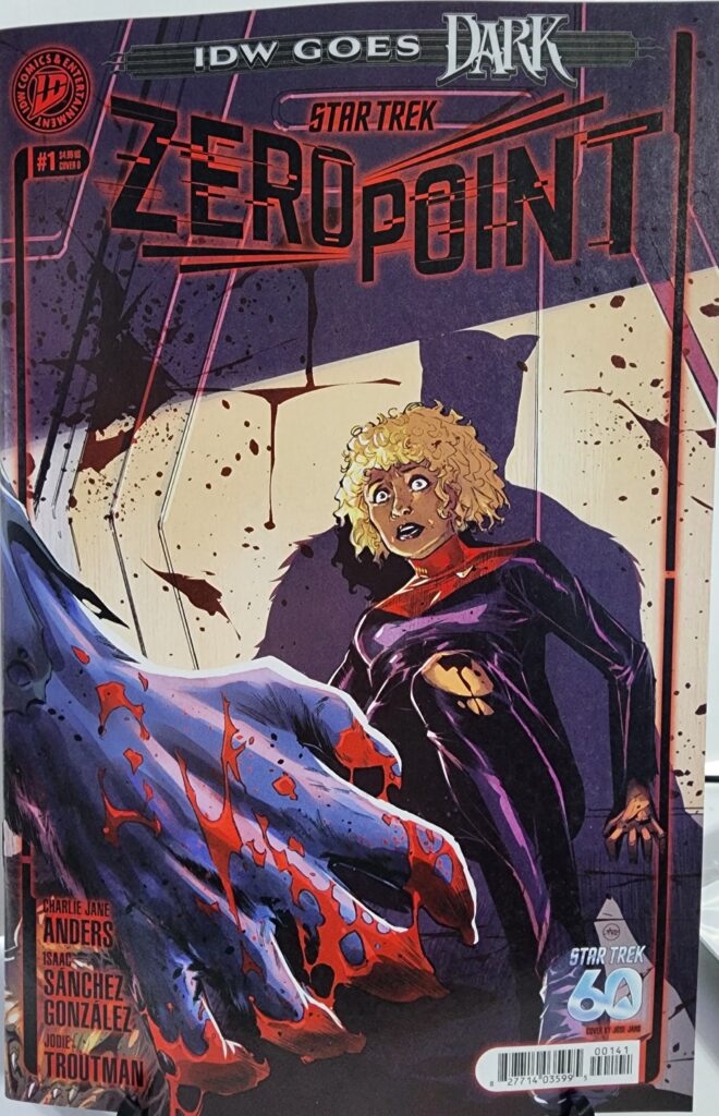
This copy features the Cover D Jose Jaro IDW Goes Dark Variant, giving the new science-fiction series a dramatically darker, horror-inspired presentation.
Comic Book Details
Title: Star Trek: Zero Point
Issue: #1
Volume: 1
Publisher: IDW Publishing
Release Date: October 14, 2026
Cover Date: October 2026
Written By: Charlie Jane Anders
Art: Isaac Sánchez González
Cover Variant: Cover D IDW Goes Dark Variant
Cover Artist: Jose Jaro
Cover Price: $4.99
Pages: 32
UPC: 82771403599500141
The exact Cover D credits Jose Jaro for pencils, inks, and colors. Grand Comics Database
Jose Jaro’s IDW Goes Dark cover immediately separates this edition from the brighter science-fiction imagery normally associated with Star Trek. A terrified Starfleet officer recoils from a blood-covered, unidentified figure while harsh reds, purples, and shadows turn the normally clean Starfleet environment into something closer to a horror scene.
The artwork fits IDW’s Goes Dark theme particularly well because it takes the optimism and order associated with Starfleet and replaces it with uncertainty, violence, and fear.
Star Trek: Zero Point #1 Comic Review: Story Analysis
Star Trek: Zero Point #1 begins with Raffi Musiker taking command of the U.S.S. Endeavour.
Her first assignment is anything but routine.
Starfleet gives Raffi a highly classified directive centered on a powerful experimental artificial intelligence constructed from mysterious technology recovered in the Epsilon Corridor. The system can supposedly predict threats before they occur. Midtown Comics
That sounds like an incredible advantage for Starfleet, but it also creates the central question of the series: how much authority should anyone give to a machine nobody completely understands?
Raffi is instructed to follow its guidance while systems fail, pressure builds, and missions become increasingly dangerous. Her responsibility is no longer simply to investigate strange phenomena. She has to decide whether the intelligence directing the Endeavour is actually protecting the Federation—or steering the crew toward something worse. Midtown Comics
The setup is particularly well suited to Star Trek because it turns a technological breakthrough into an ethical and command problem.
An artificial intelligence capable of predicting the future could prevent disasters and save millions of lives. It could also manipulate decisions, eliminate uncertainty, and place enormous power in the hands of whoever controls it.
The discovery of a starship graveyard on the moon only makes the mission more unsettling. Midtown Comics
A new Star Trek title has to accomplish several visual tasks at once. The ships, uniforms, technology, and Starfleet environments need to feel recognizable while the new crew and mission still need their own identity.
Zero Point’s classified technology provides an opportunity to introduce something that does not fit comfortably within normal Federation expectations.
That is especially important for a story in which the characters themselves do not fully understand the technology they are being ordered to trust.
For this edition, however, Jose Jaro’s cover gives the book a completely different first impression.
Instead of emphasizing starships or heroic exploration, Jaro focuses on fear.
The frightened Starfleet officer, blood-spattered imagery, and threatening foreground figure turn Zero Point into something that looks almost like a space-horror book.
That tension actually complements the story. Raffi may technically be beginning a Starfleet mission, but the cover suggests immediately that something about this assignment is badly wrong.
Character Development
Raffi Musiker is an especially interesting character to place in command of a mission involving secrecy and questionable technology.
Raffi has never been someone who blindly accepts what institutions tell her.
Now she is responsible for an entire crew while Starfleet itself is asking her to trust an artificial intelligence whose capabilities and origins are not completely understood.
That changes the nature of her skepticism.
Questioning an order when you are working alone is one thing. Questioning the information guiding an entire starship is something else entirely.
Every decision now affects the officers serving under her.
The situation also creates an interesting conflict between instinct and data.
If the AI predicts a threat but Raffi’s judgment says something different, which one should a captain trust?
That question gives Zero Point a strong foundation for exploring Raffi as a commanding officer rather than simply returning her to another supporting role.
Collectibility and Market Significance
Star Trek: Zero Point #1 launches a new IDW Star Trek series and gives Raffi Musiker command of the U.S.S. Endeavour.
The first issue was released with multiple covers, including the standard Valeria Favoccia Cover A, a photo variant, Viktor Farro foil, the Jose Jaro IDW Goes Dark Cover D, and a Blank Sketch Cover E. Penguin Random House Comics Retail
The Jose Jaro version is an open-order $4.99 variant, not a ratio incentive, so collectors should not automatically treat it as scarce. Grand Comics Database
Its appeal comes primarily from the artwork and the Goes Dark theme.
This cover presents Star Trek in a visual style very different from the franchise’s normal promotional imagery. That gives it crossover appeal for collectors who follow horror-themed variants as well as traditional Star Trek collectors.
Jose Jaro’s complete cover credit—pencils, inks, and colors—also makes this a clearly identifiable artist variant rather than simply an alternate trade-dress edition. Grand Comics Database
Final Verdict
Star Trek: Zero Point #1 starts with a premise that feels appropriately Star Trek while still giving the new series its own mystery.
Raffi Musiker receives command of the U.S.S. Endeavour and immediately finds herself responsible for missions dictated by an experimental artificial intelligence built from technology Starfleet does not completely understand.
That creates questions about command, trust, artificial intelligence, and the risks involved when technology begins making decisions faster than the people responsible for using it.
Charlie Jane Anders provides the science-fiction mystery while Isaac Sánchez González establishes the visual world of the new series.
For collectors, the Jose Jaro IDW Goes Dark Variant is particularly interesting because it takes the normally optimistic visual language of Star Trek and pushes it directly into horror.
Recommended for Star Trek readers, Raffi Musiker fans, Jose Jaro collectors, IDW Goes Dark collectors, and readers who enjoy science-fiction stories about artificial intelligence and questionable technology.
Star Trek: Zero Point #1 Jose Jaro IDW Goes Dark Variant is available from Razmataz Comics & Hobbies at razmatazcomics.com while supplies last.